Eventure
A web/application to discover events nearby
Project Overview

As event discovery continues to play a key role in social and cultural engagement, we chose it as the focus of our concept project. Key features of Eventure include:
Personalized event discovery powered by interest-based recommendations and location-based filtering
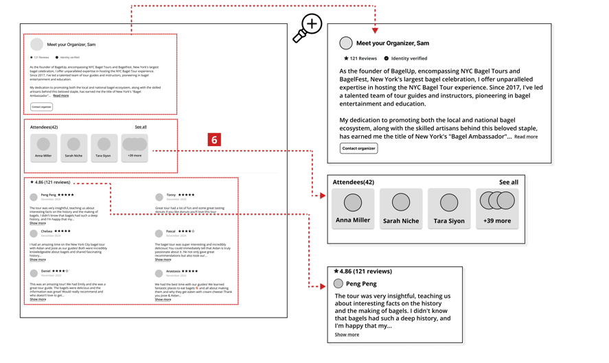
Transparent organizer profiles with accessible event details, including host information, venue, and schedule
Interactive attendee visibility so users can see who else is attending and explore shared interests
Built-in social features that enable users to connect and engage—turning events into community experiences
About the Project
Role
Tools
Team
Duration
UX/UI Designer
Figma
Miro
Maze
Zoom
Group of Two
12 weeks
Part-Time
Target Users
Our target users include two main groups:
1. Individuals searching for nearby events that match their interests and foster social connection.
2. Individuals, companies, or organizers aiming to create and promote their own events.
This case study focuses on the needs of the first group—event seekers.
The second user group's needs is explored in a separate case study, which you can view here.
Challenges:
Users have a wide range of interests, making it difficult to design a recommendation system that feels personalized and relevant to everyone.
Integrating features like filtering, recommendations, booking, and social connection while keeping the interface clean and intuitive was a significant design challenge.
Designing a way for users to see who’s attending and connect with others without making the platform feel intrusive or cluttered.
Creating a smooth and error-free ticketing and booking process while minimizing friction points, especially for mobile users.
Design Process
We followed the Double Diamond framework to guide our design journey—starting with broad exploration to understand user needs, then narrowing down to define the problem, ideate solutions, then moving into the design stage to bring ideas to life, and finally deliver focused, user-centered outcomes through iterative testing and refinement.
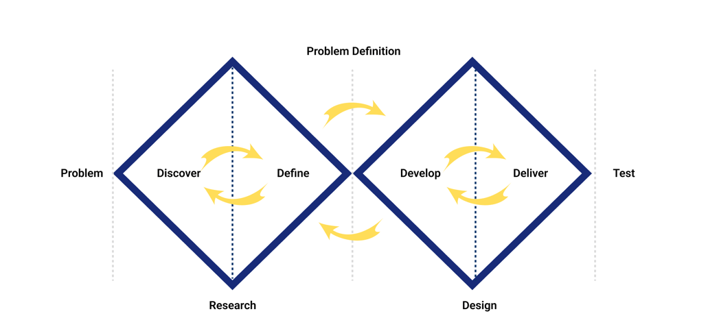
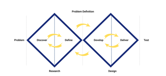
Research


Methodology
Interview & Affinity Diagram
Competitive Analysis
At the start, we conducted thorough market research to understand the event discovery industry, analyze competitors, and identify potential users' needs. We reviewed four similar websites to analyze their features and workflows. This analysis helped us design a more efficient information architecture and identify the essential features our platform should include.
Competitive Analysis
Interview & Affinity Diagram
To gain deeper insights into users’ experiences with discovering and attending events, we conducted open-ended interviews with 10 participants. This conversational approach allowed for more natural, in-depth discussions beyond rigid question-and-answer formats.
After analyzing the interview findings, we created an affinity diagram to organize related pain points, behaviors, and insights—helping us identify key themes that would guide our design decisions.
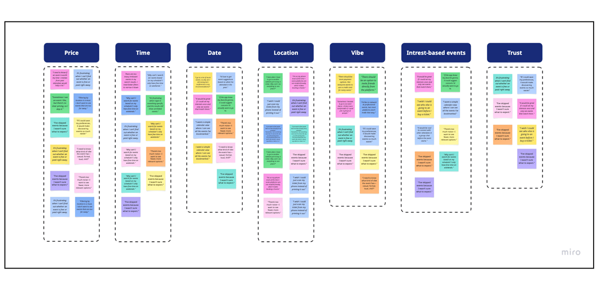
The affinity diagram allowed us to identify key user expectations and recurring pain points related to discovering and attending events. Participants emphasized the need for clear and accessible event information—such as date, time, pricing, and location—as well as personalized, interest-based recommendations. Trust also emerged as a critical factor, with users highlighting the importance of ensuring reliability and transparency throughout the platform.
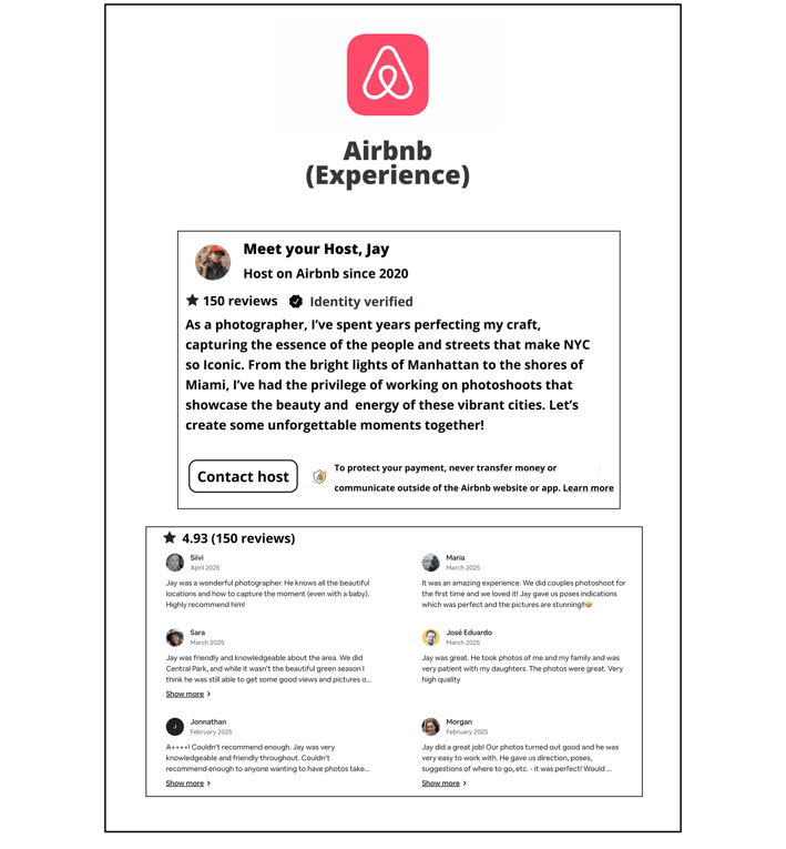
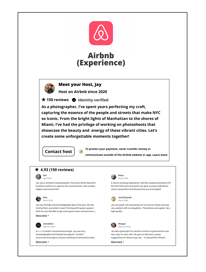


To strengthen trust and transparency on Eventure, we drew inspiration from Airbnb’s organizer profiles and reviews.
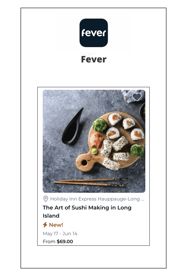
We Utilized ideas from Fever’s 'New' icon to visually spotlight fresh experiences in Eventure and effectively capture user attention.
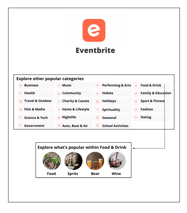
We were inspired by Eventbrite’s category structure to make event browsing in Eventure more intuitive and efficient.
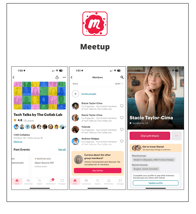
We Applied Meetup’s features to implement attendee visibility and event chat in Eventure.
Define
Persona
Challenges & Solutions
After completing our research and identifying key problems, we ideated potential solutions and translated them into mid-fidelity wireframes for both the application and the website.
All solutions are zoomed in on the right panel to enhance clarity and highlight design changes.
The left frame shows the full layout for overall context.
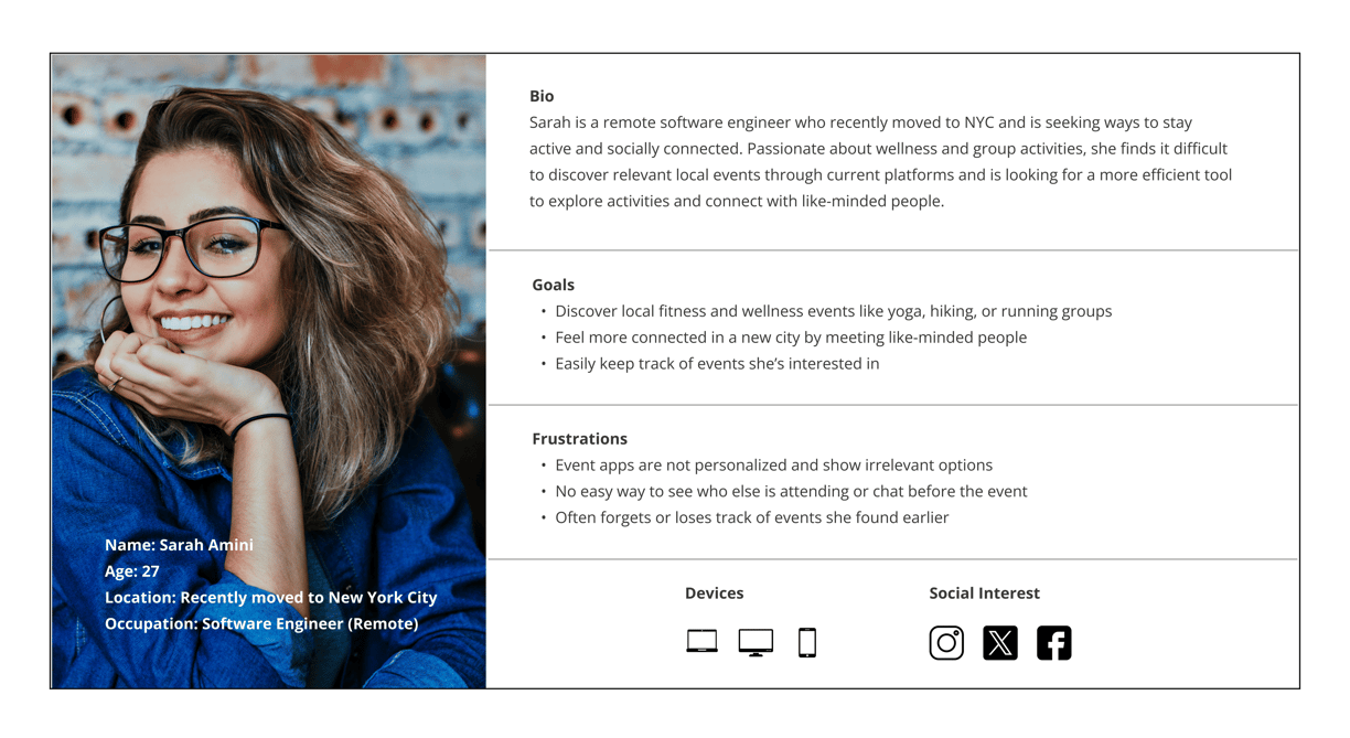
To ground our design decisions in real-world user behavior, we created a detailed persona and storyboard that illustrate our target user's motivations, challenges, and goals. This helped us visualize the user's journey, identify pain points, and design solutions that align with their expectations and daily routines.

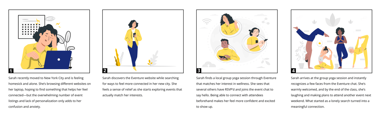
Storyboard
The storyboard captures a day-in-the-life scenario of our persona, highlighting key moments of frustration and opportunity as they search for events. This visual narrative helped us empathize with the user, understand their context, and design a more intuitive and supportive event discovery experience.
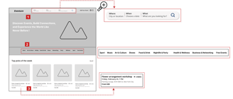
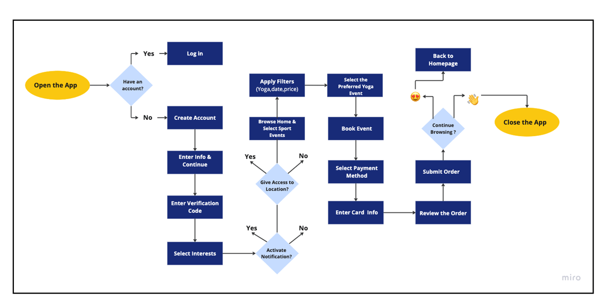
User Flow
This user flow outlines the key steps a user takes to search for, explore, and book a local yoga event through the app. It helped us design a seamless and intuitive journey—from entering preferences to final ticket confirmation—focused on ease, clarity, and user satisfaction.
Cart Sorting
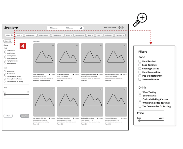
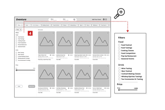
To improve information architecture, we conducted a close card-sorting activity to organize 36 events into intuitive categories.
User input revealed nine main categories, later refined to ten with the addition of Free Events based on user needs—ensuring a structure that aligns with real user expectations and browsing behavior.


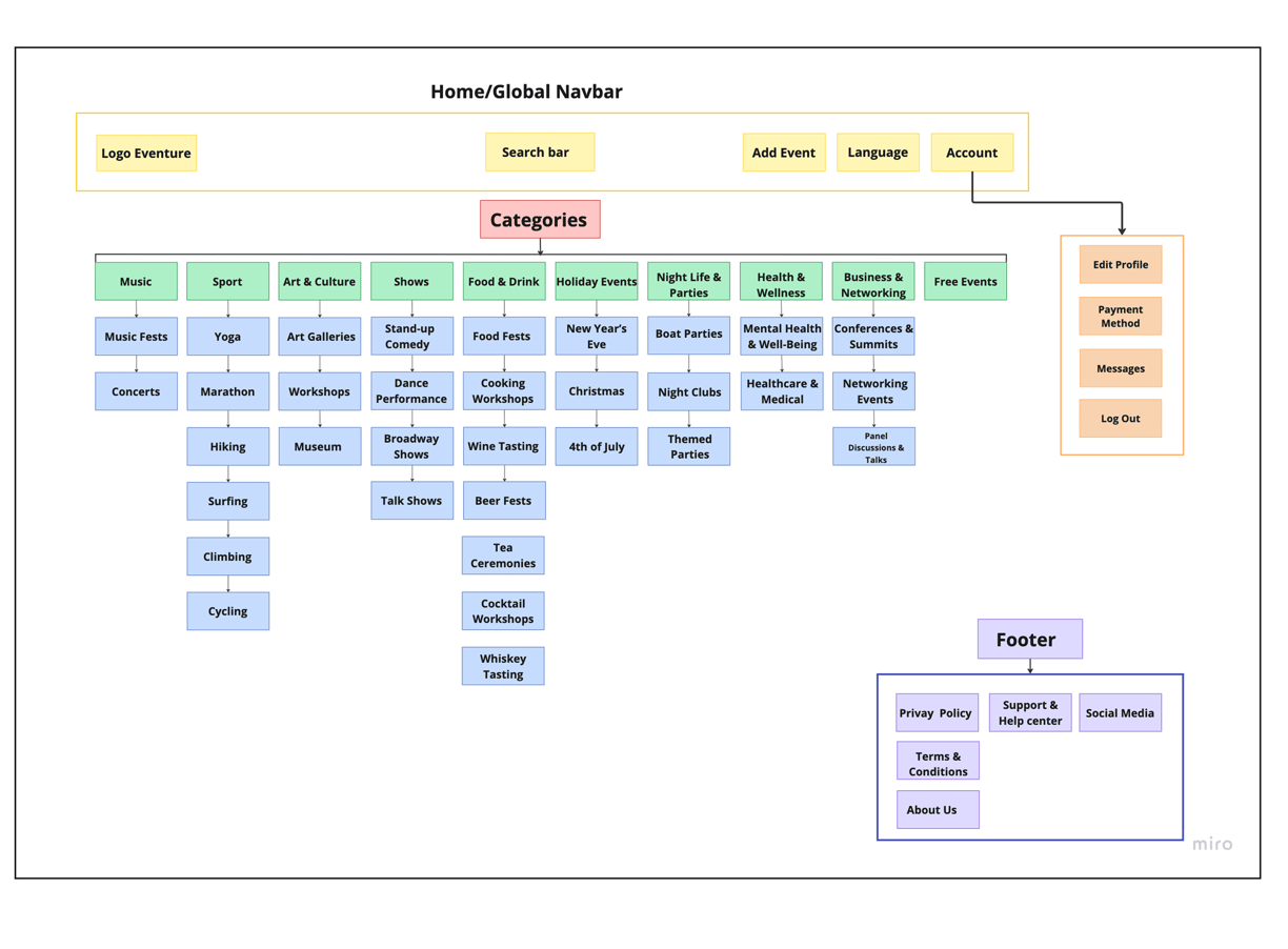
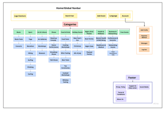
Site Map
We designed the information architecture of our platform to support seamless navigation and align with user expectations. Drawing from insights gathered through card-sorting sessions, we organized the content into 10 main categories: Nightlife & Parties, Holiday Events, Food & Drink, Shows, Sports, Music, Art & Culture, Business & Networking, Health & Wellness, and Free Events. The Free Events category was specifically added in response to user interests and needs for more accessible experiences.
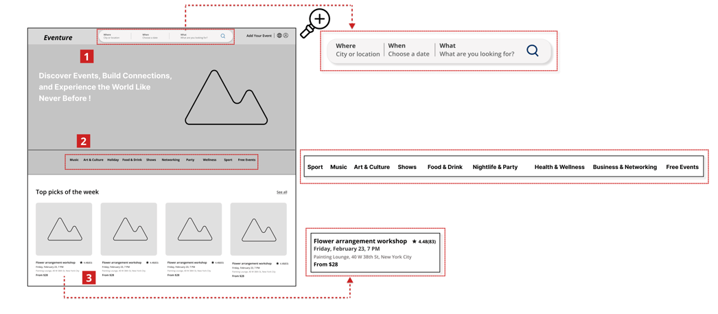
1. Users were unsure if events were relevant to their location or travel range.
2. Users found it difficult to narrow down event options quickly and efficiently.
3. Users found browsing slow and frustrating due to the need to click multiple times for basic event details.
1. Added location-based filtering
2. Added event categories on the homepage
3. Added key event details (time, date, location, price) below or next to each card for quick access
Challenge
Solution
Challenge
Solution
4. Users found it difficult to narrow down event options quickly and efficiently.
4. Added smart filtering


Challenge
Solution
5. Users were unsure about events vibe or atmosphere.
5. Added more photos and an “About This Event” section to convey the vibe more clearly.
6. Users struggled to trust event reliability and Organizers.
6. Added organizers and attendees visibility, chat feature, and review for both organizer and event
Challenge
Solution
Challenge
Solution
7. Users felt frustrated by irrelevant, event suggestions.
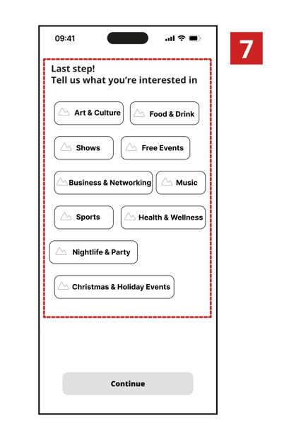
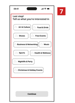
7. Added favorite category selection during sign-up to personalize recommendations
Develop
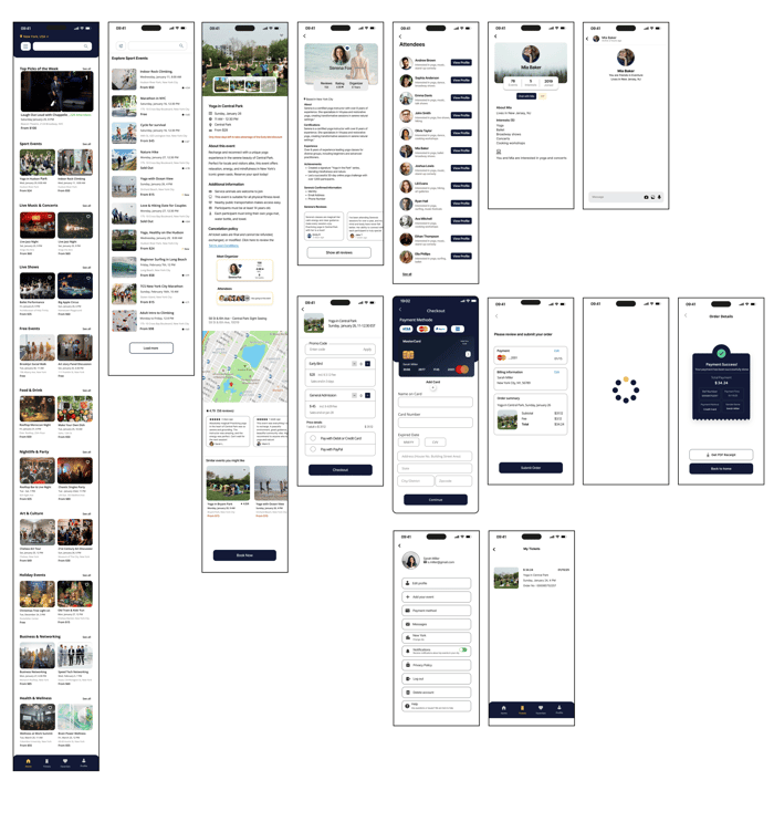
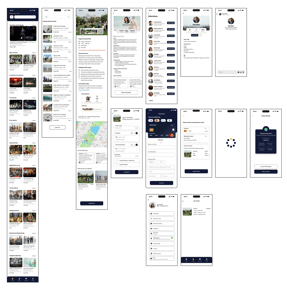
Ideation & Wire-framing
After developing potential solutions through mid-fidelity wireframes, we conducted usability testing to evaluate their effectiveness and identify opportunities for further refinement.
Below, you can see the mid-fidelity wireframes before and after usability testing.
All changes were zoomed in to highlight key sections of the design before and after usability testing, making the improvements clearer and easier to visualize.
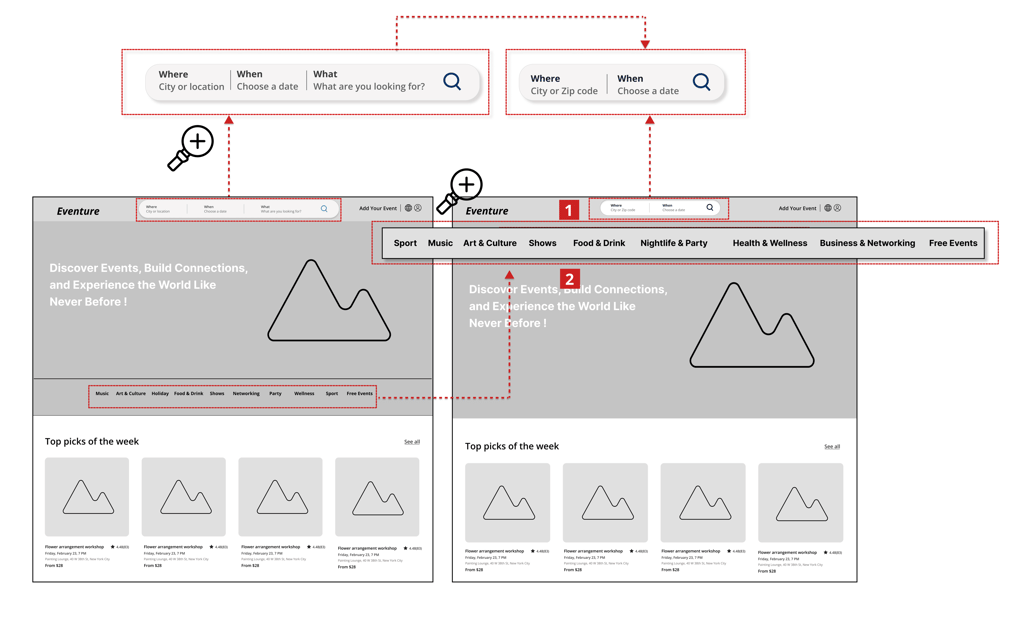
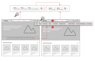
1. Replaced the “What” search bar with “Where” and “When” fields to better match user needs and help filter events more efficiently.
2. Moved event categories above the hero image to increase visibility and speed up event discovery.
Homepage/web
Before
After
Event Category/web
Before
After
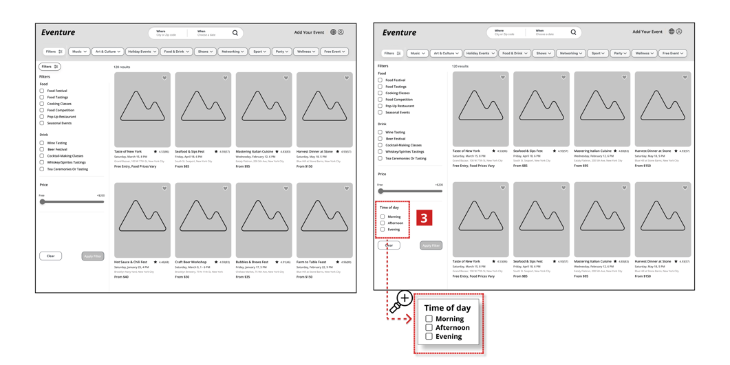
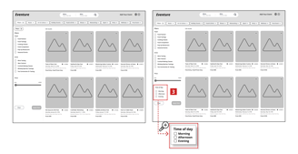
3. Added a “Time of the Day” filter to help users quickly find events that fit their daily routines, enhancing relevance and reducing overwhelm.
Homepage/App
Before
After
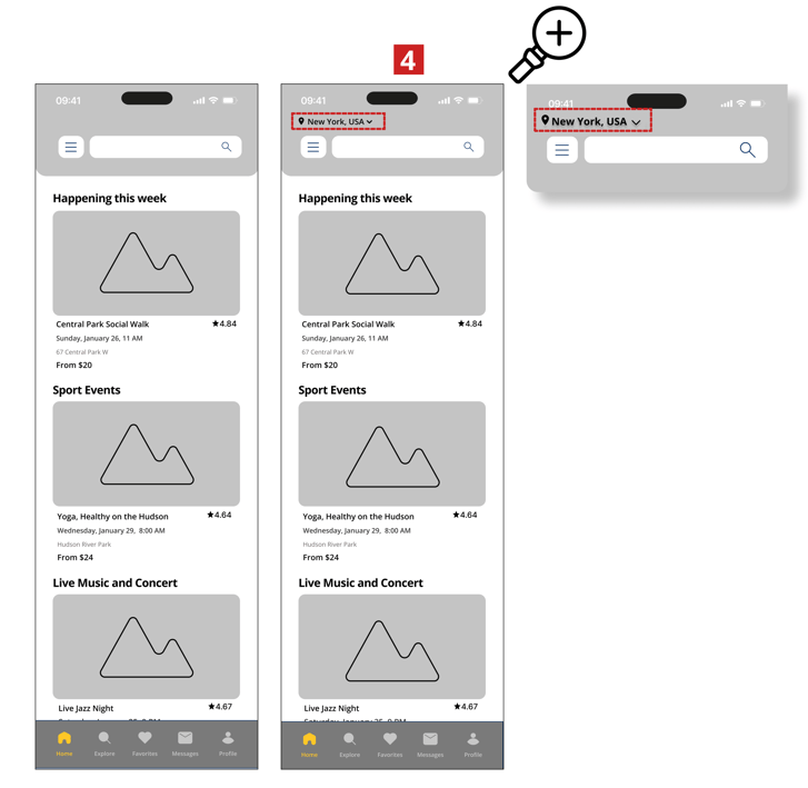
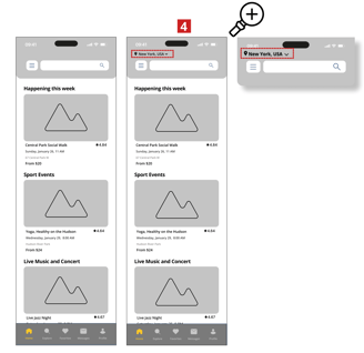
4. Added a location dropdown at the top of the page to help users easily identify and change the city, addressing confusion found during usability testing.
Yoga Event Page/App
Before
After
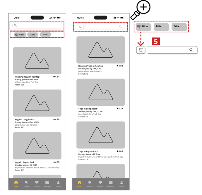
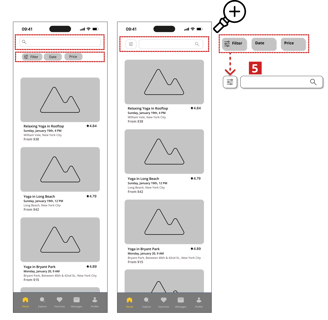
5. Refined the layout by consolidating filters into a hamburger menu and eliminating extra buttons below the search bar to enhance clarity and focus.
Deliver
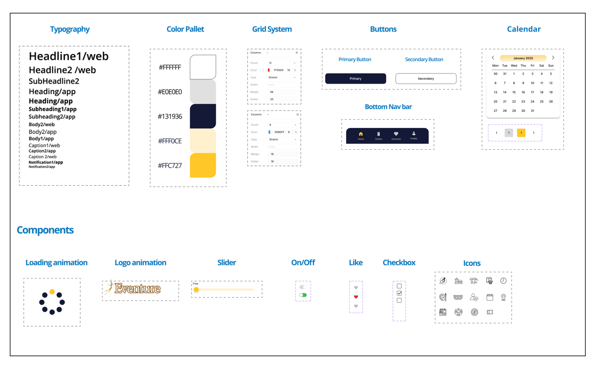
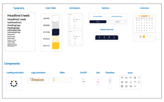
To start designing high-fidelity interfaces, we established a design system that ensured consistency across all screens, defining colors, typography, and element dimensions.
This visual foundation sets the tone for a dynamic and user-friendly event discovery experience.
UI Design Direction
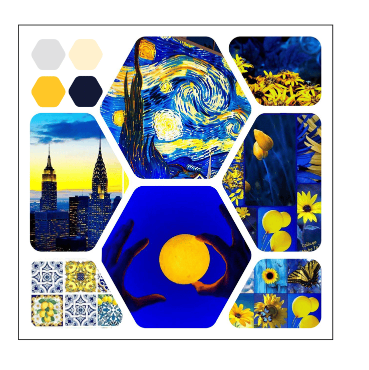
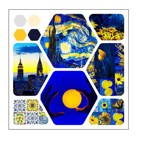
Mood Board
The mood board for Eventure platform features a vibrant blend of blues and yellows inspired by nature and art. The color palette conveys energy, optimism, and trust.
Usability and Iterations
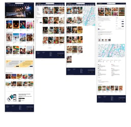
After designing the high-fidelity wireframes, we conducted a second round of usability testing and made iterative improvements wherever needed. Below, you can see the before and after versions of the high-fidelity designs for both web and mobile app.

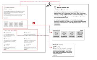
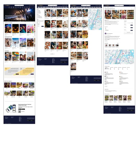
Final Event Page/Web
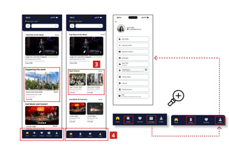
Homepage/App
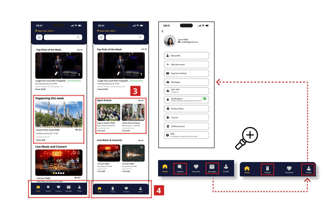
3. Updated the layout to display two events per row, improving space usage and speeding up browsing.
4. Replaced the “Messages” tab with a “Tickets” tab to provide users with quicker access to their purchases.
Removed the “Explore” tab from the bottom navigation to eliminate redundancy with the top search bar and streamline the navigation experience.
Relocated “Messages” to the “Profile” section for a more intuitive and organized layout.
5. Changed the price color from red to black to avoid confusion with sold-out events.
6. Reduced image size and placed event details beside it to speed up scanning and improve browsing efficiency.
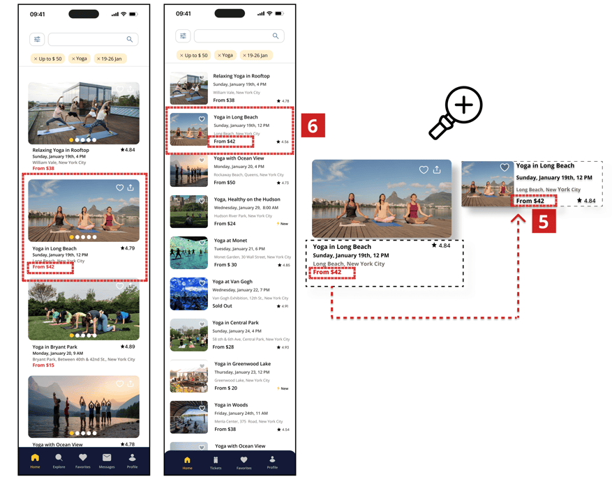
Yoga Event page/App
Before
After
Before
After
Before
After
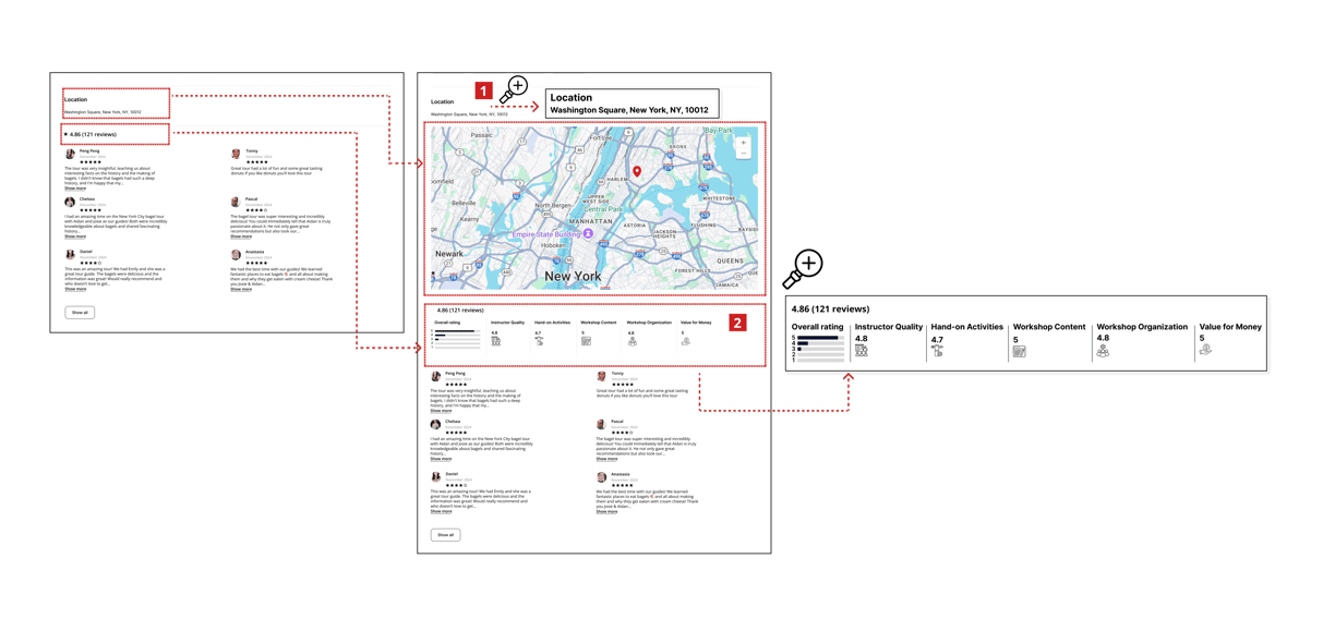
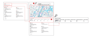
1. Added an interactive map helps users quickly understand the event’s exact location, plan their route, and feel more confident attending.
2. Added detailed ratings (e.g., Instructor Quality, Workshop Content) and a visual breakdown builds trust and transparency, helping users make faster, more informed decisions.
Final Prototype
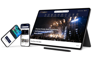
You can check out the final clickable prototype for both mobile and desktop version here:
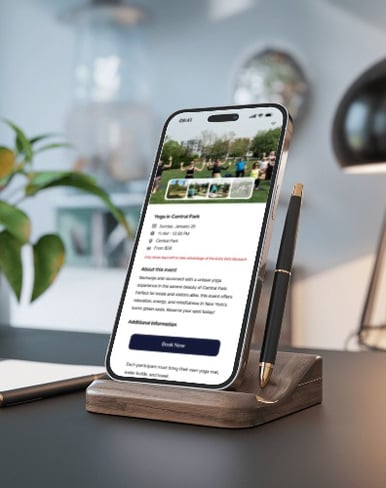
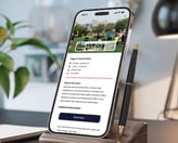
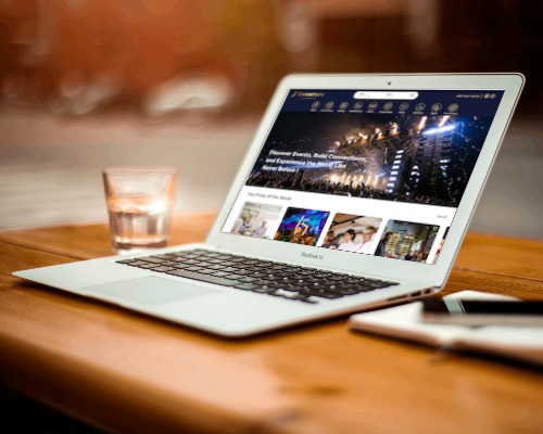

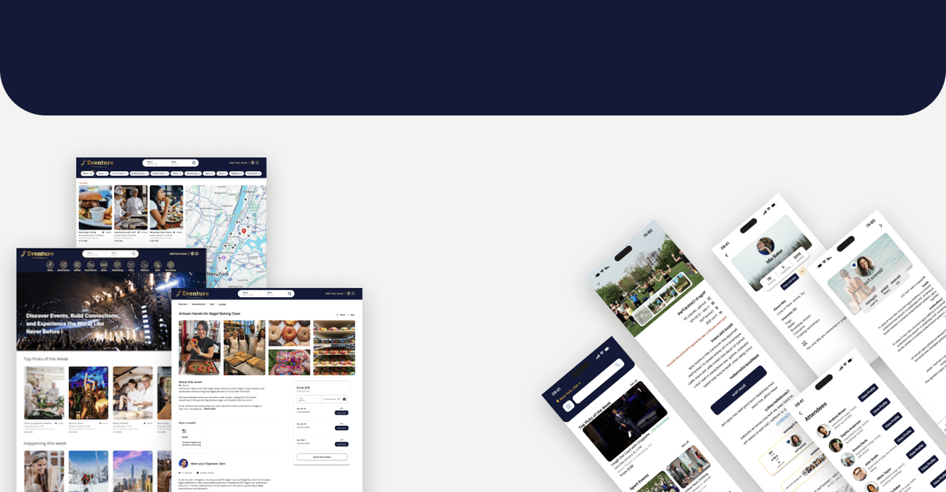
Here, you can see the final design of some selected pages for both the website and application.
Challenges & Key Takeaways
During this project, we faced several group challenges, which gave me the opportunity to strengthen my skills in managing team dynamics, coordinating tasks, and organizing our time and workflow to meet project deadlines.
The Next Step
Moving forward, we aim to further refine Eventure by:
Conducting more in-depth usability testing to enhance the user experience and identify areas for improvement.
Expanding event discovery by integrating AI-driven recommendations based on user behavior and preferences.
Improving networking features with interactive attendee engagement tools, such as event chatrooms.