
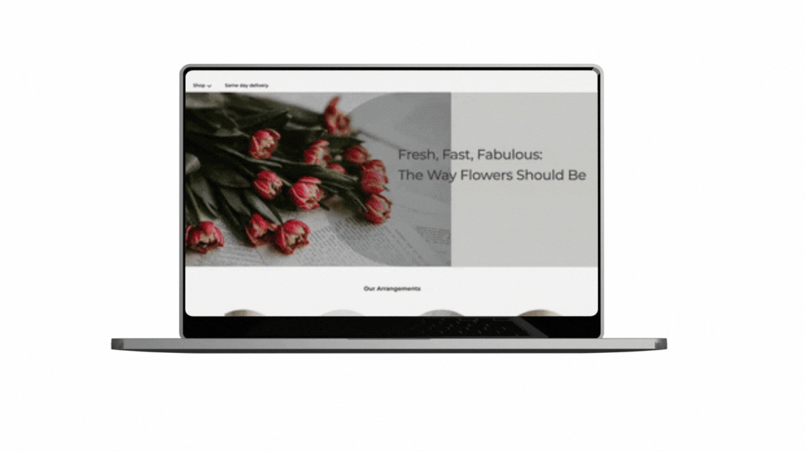
Dallas Flower Florist
An Online Flower Shop / A website redesign
Project Overview
About the Project:
Redesigned the Dallas Flower Florist website
Identified major usability issues
Refined the site’s information architecture and layout
Elevated the end-to-end user journey
About the Business:
Dallas Flower Florist is an online floral business with branches across multiple cities in Canada, Mexico, and the USA. Customers can conveniently browse and order floral arrangements through the website, and their orders are fulfilled by the nearest branch in their city.
UX/UI Designer
Figma, Miro Zoom, Paper, pencil
Group of 4
1 Month Part-time

Role
Tools
Team
Duration
Design Process
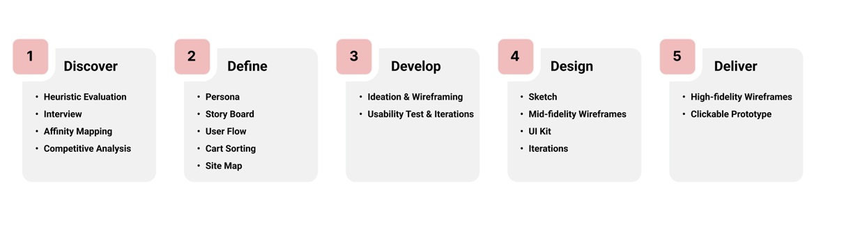
Discover
Results of Heuristic Evaluation:
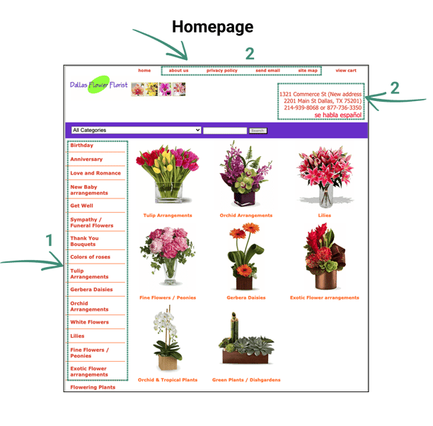
The categories on the homepage were disorganized, making navigation confusing.
Overuse of the color red in the fonts created a sense of error and alarm for users.
The types of floral arrangements were not clearly labeled, requiring users to perform additional searches to understand their options.
Delivery information (availability in Canada, Mexico, and the US) was only revealed during the checkout process.
Several other usability issues were noted, which we addressed during the redesign.
Heuristic Evaluation
In the initial stage of our research, we conducted a heuristic evaluation to gain a deeper understanding of the business and assess the website's usability. This served as a foundational step in identifying key usability issues and areas for improvement.
Competitive Analysis
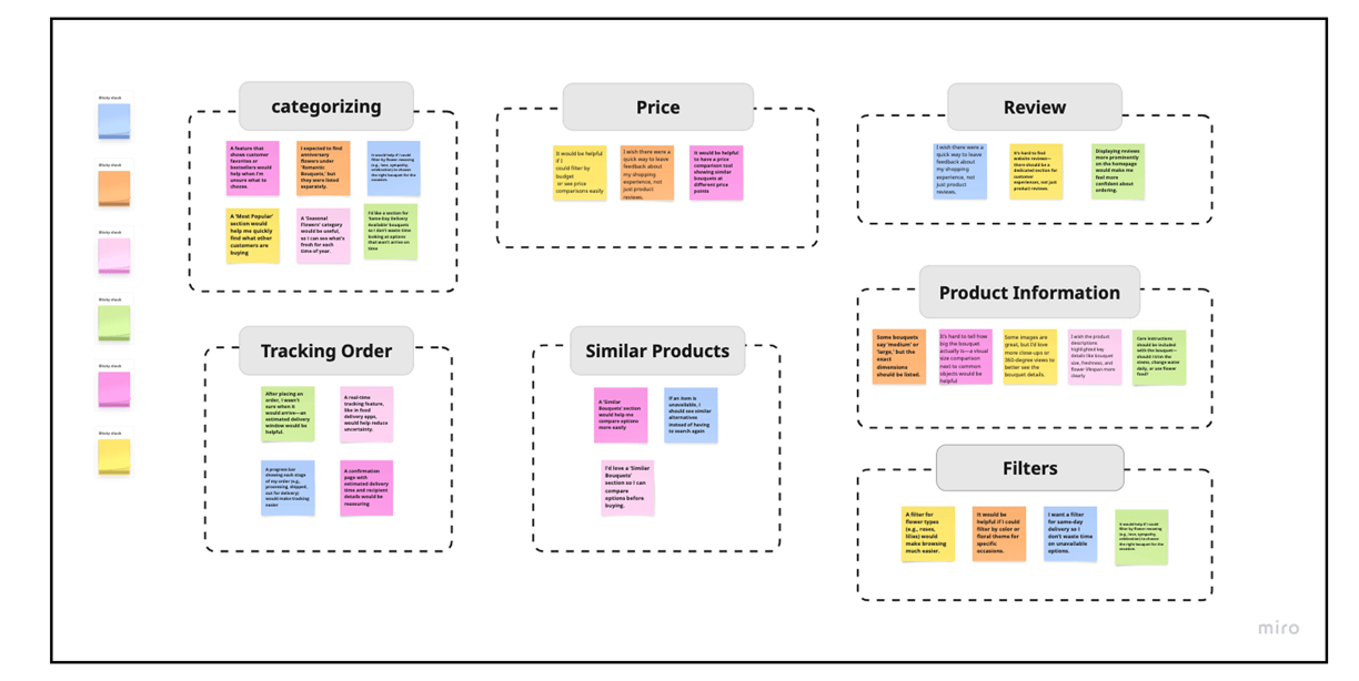
Interview & Affinity Mapping
Following Heuristic evaluations to obtain complementary data, we conducted user interviews to gain deeper insights into user needs, behaviors, and pain points. We interviewed with 14 persons. Based on these findings, we created an affinity map to identify key themes and patterns, guiding our design decisions for an improved user experience.


Research Methods
Heuristic Evaluation
Interview
Competitive Analysis
To gain a deep understanding of the website’s pain points and user needs, we conducted research using the following methods. The insights gathered from this process shaped our design decisions, ensuring a seamless, user-friendly, and efficient platform that aligns with customer expectations.
The user interviews and affinity mapping helped us to:
Identified user expectations for clear and accessible product details, including pricing, size, and delivery options.
Highlighted the need for intuitive site navigation and easy filtering by occasion, flower type, and price range.
Uncovered pain points in the checkout process, such as too many steps and lack of delivery transparency.
1. Disorganized categories
2. Unstructured information architecture
3. Inappropriate CTAs
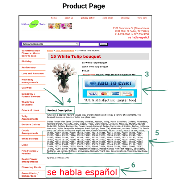
4. Insufficient product description
5. Listed zip codes
6. Used two different languages
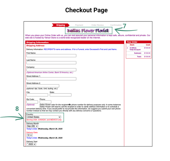
7. Use two different logos at checkout page
8. Listed delivery countries at the final stage of checkout
Issues identified on the homepage
Issues identified on the product page
Issues identified on the checkout page
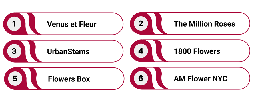
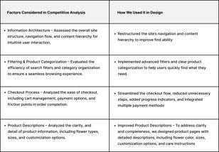
In the next step of our research, we conducted a competitive analysis to explore effective design patterns and common user experience strategies in the floral e-commerce space. Our analysis focused on navigation, filtering, checkout flow, and product presentation across six florist websites.
A summary of our findings and how they informed our redesign can be seen in the table below.
Define
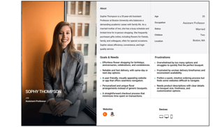

Sophie, a 35-year-old assistant professor, is overwhelmed with work. She suddenly remembers that her friend’s birthday is tomorrow. She feels nervous and unsure of what to do.
Sophie talks to a colleague about her situation. The colleague suggests ordering flower and recommends Dallas Flower Florist, mentioning that she has used it several times and always had a good experience.
Following her colleague’s advice, Sophie visits the Dallas Flower Florist website. She is pleased to see a wide variety of flowers and arrangements.
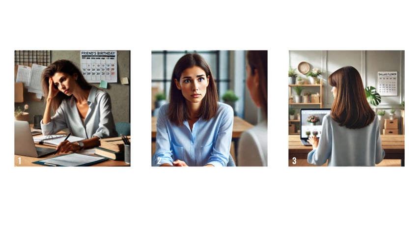
Sophie applies filters based on price, color, arrangement, and delivery date to narrow her options
Sophie selects the flower box she likes the most, adds it to her cart, proceeds to checkout, enters her payment information, and places the order successfully.
After placing the order, Sophie tracks the delivery status to ensure the flowers will arrive on time.
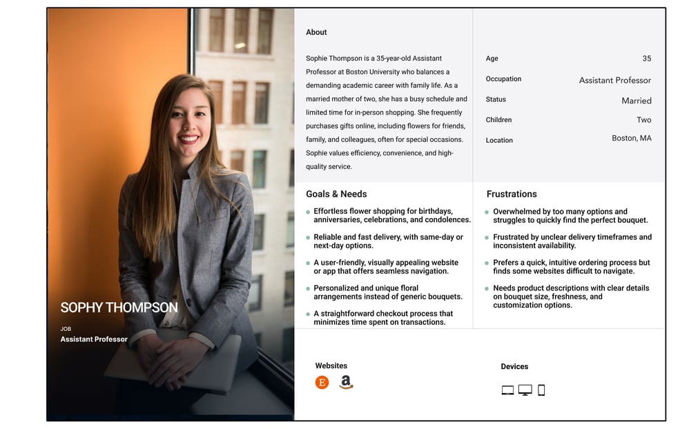
To define our design tasks and showcase user insights from our research, we developed a persona and scenario to represent user needs, behaviors, and goals.
Persona
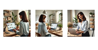
Story Board
All images are generated by AI
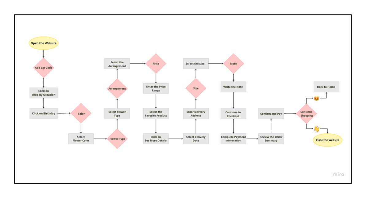
User Flow
At this step, we designed the user flow for the task – This flowchart illustrates the step-by-step journey a user takes when ordering flowers online, from opening the website and selecting the occasion to filtering by flower type, color, and price, adding the product to the cart, completing payment, and confirming the order. Our task was ordering a flower box for a birthday.
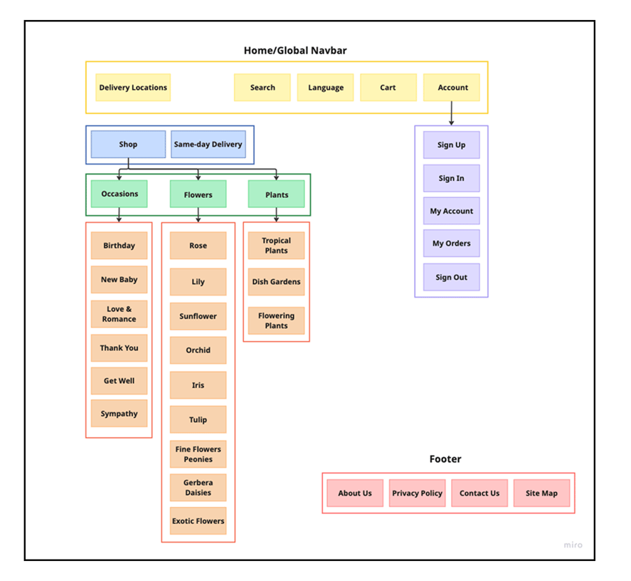
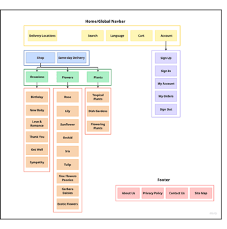
Site Map
Based on user research and competitive analysis, we designed the site map to reflect a clearer, more organized structure aligned with user expectations.
Develop

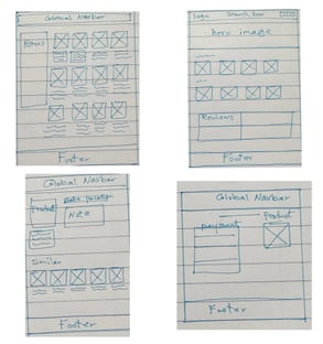
Ideation & Wire-Framing
What Guided Our Redesign Decisions?
Our redesign was driven by key insights from research, focusing on user pain points and effective solutions to enhance the overall experience.
Solutions are shown in the mid-fidelity wire-frames
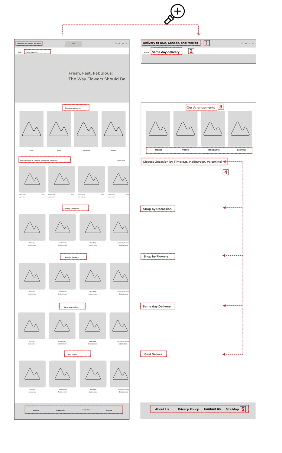

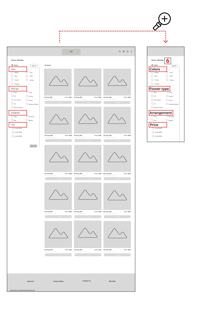
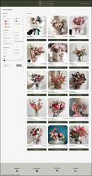
Homepage
Birthday Category Page
Usability and Iterations(Phase 1)
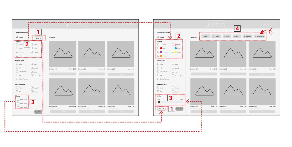
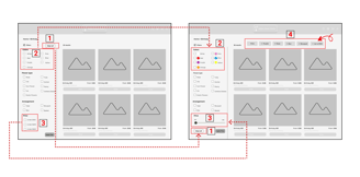
Moved the “Clear All” button next to “Apply Filter” at the bottom, as users in testing overlooked the top button, leading to repeated confusion and inefficient filtering.
Replaced text-only color names with labeled color circles after usability testing revealed that users hesitated or made incorrect selections due to a lack of clear visual cues.
Switched from fixed checkboxes to a range slider based on user feedback that preset options felt restrictive and didn’t match their intended budgets.
Added filter summary bars at the top of the results page because users often forgot which filters were active, leading to disorientation and longer task completion times.
We conducted usability testing on mid-fidelity wireframes to identify pain points and gather user feedback. Insights from these sessions informed multiple design iterations, helping us improve clarity, flow, and overall user experience before moving to high-fidelity designs.
Before/Birthday category page
After/Birthday Category page
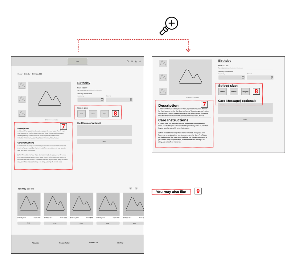
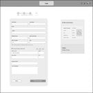
Before/Product Page
After/Product page
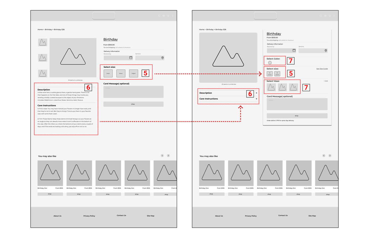
Initially, flower sizes were labeled using vague terms like "Grand" or "Deluxe," which confused users. We replaced these with clear number of stems options for better understanding.
First, product description and care info always visible, creating a long scroll. To reduce visual clutter, we placed the product description and care instructions in accordion sections, allowing users to expand content as needed.
Additionally, we introduced a new option that allows users to select both the vase type and color directly on the product page—enhancing customization and overall user satisfaction.
All solutions are zoomed in on the right panel to enhance clarity and highlight design changes.
The left frame shows the full layout for overall context.
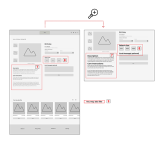
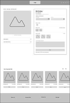
product Page
Solutions
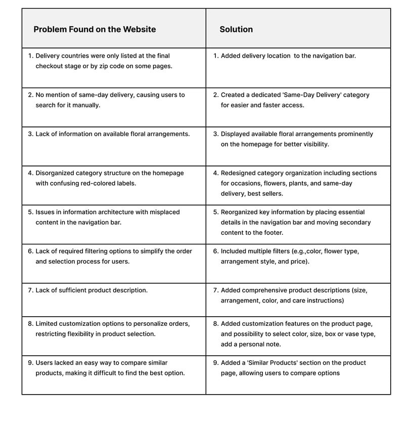
1. Added delivery location to the navigation bar.
2. Created a dedicated 'Same-Day Delivery' category for easier and faster access.
3. Displayed available floral arrangements prominently on the homepage for better visibility.
4. Redesigned category organization including sections for occasions, flowers, plants, and same-day delivery, best sellers.
5. Reorganized key information by placing essential details in the navigation bar and moving secondary content to the footer.
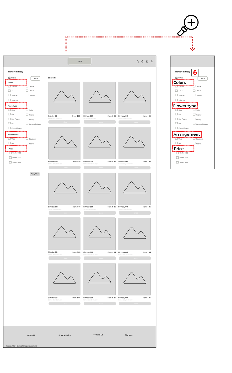
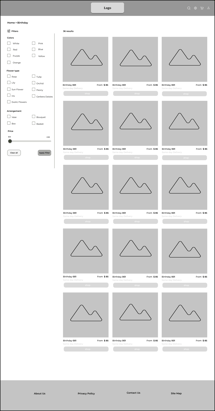
6. Included multiple filters (e.g.,color, flower type, arrangement style, and price).
7. Added comprehensive product descriptions (size, arrangement, color, and care instructions)
8. Added customization features on the product page, and possibility to select color, size, box or vase type, add a personal note.
9. Added a 'Similar Products' section on the product page, allowing users to compare options
Design
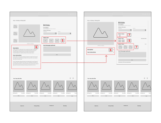
Some of our sketches and mid-fidelity designs


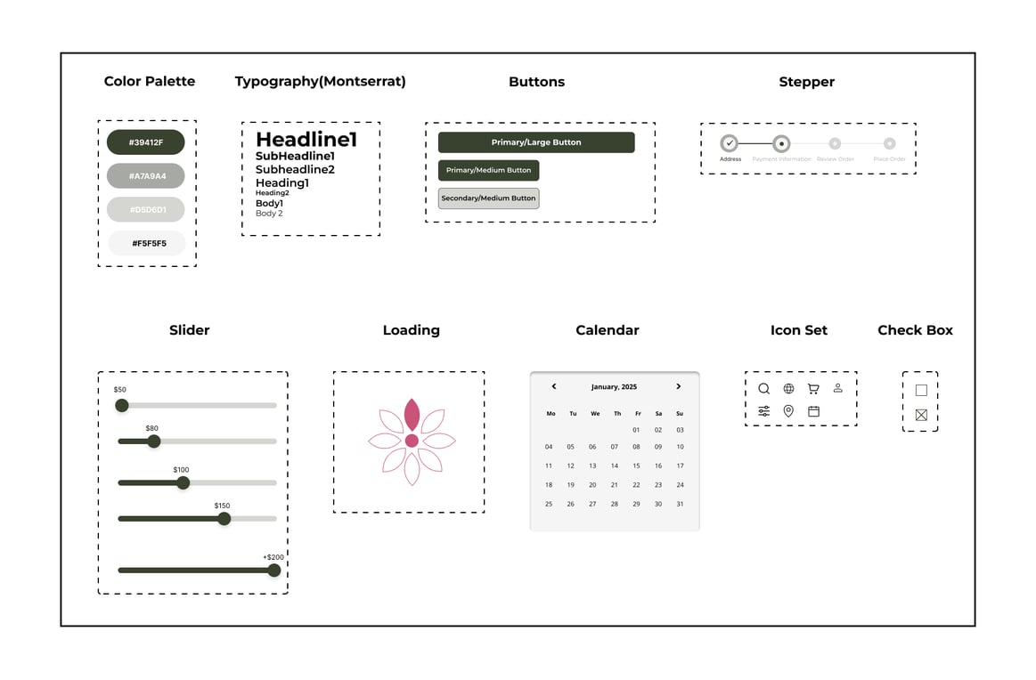
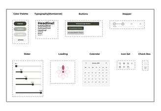
To ensure a consistent and uniform design, we created a comprehensive UI kit that includes a color palette, typography, buttons, and other essential design elements. Given that the floral products are naturally vibrant and eye-catching, we opted for muted, earthy tones in the interface to avoid visual competition. This choice allows the flowers to remain the focal point while creating a calm, elegant, and user-friendly browsing experience.
UI Kit
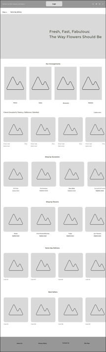
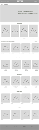
Homepage
Birthday Category Page
Product Page
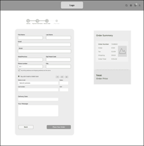
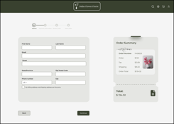
Payment Page
Before/Homepage
After/Homepage
Usability Test (Phase 2)
To ensure our final design met user expectations, we tested the high-fidelity prototypes with real users. Based on their feedback, we made targeted refinements to improve usability.
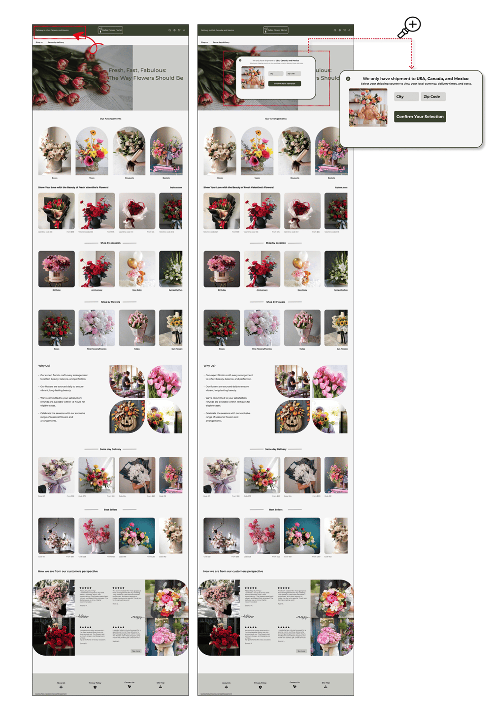
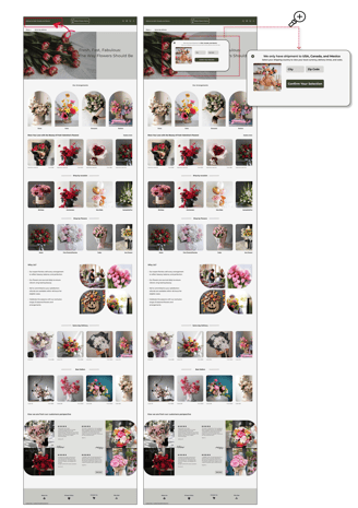
Usability testing showed users missed the delivery region alert in the first version of design.
We addressed this by adding a clear welcome pop-up that immediately informs users about delivery areas, improving visibility and reducing confusion.
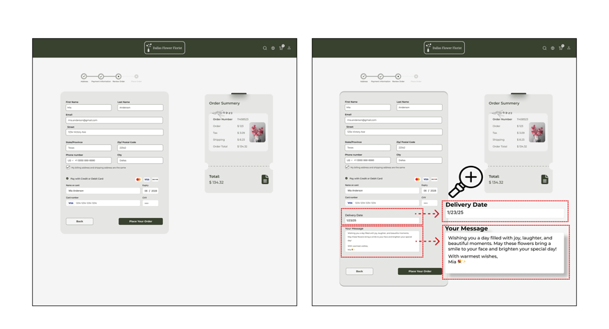
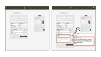
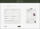
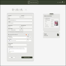
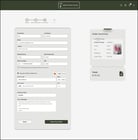
Before/Preview Page
After/Preview page
Users were unsure whether their personalized message and selected delivery date were correctly and successfully saved during checkout.
To improve clarity and user confidence, we redesigned the preview page to prominently display both the message and delivery date before placing the order—offering reassurance and a stronger sense of control.
Deliver

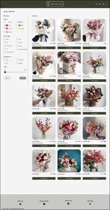
Here are some of our final design pages.

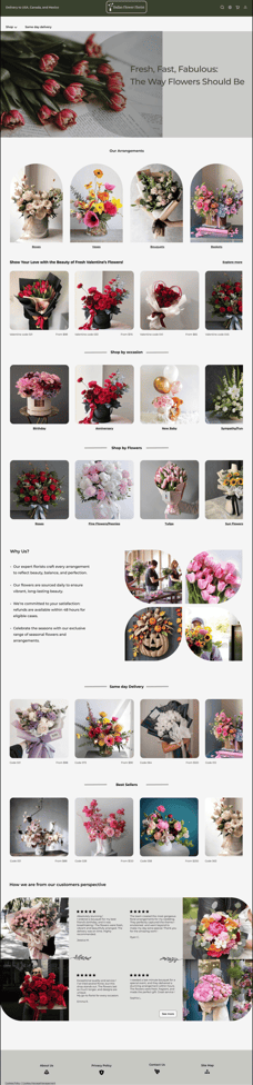
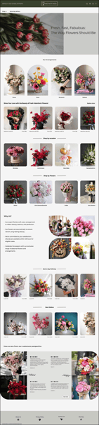
Homepage
Birthday Category Page
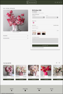
Product Page
Payment Page
Preview Page
Next Step
Usability Testing: Conduct additional user testing with the redesigned site to gather more feedback and identify any remaining pain points.
Prototype Additional Website Sections: Expand the scope of the project by working on other key areas of the website.
What did I learn?
This project deepened my understanding of how small details—like message confirmation or delivery date visibility—can affect user experience.
While the heuristic evaluation highlighted key usability issues, user interviews and usability testing uncovered deeper insights into user pain points and real-world frustrations.
I learned how to prioritize during a busy schedule. Balancing this project alongside classes and academic work taught me to manage my time strategically and use it wisely.