Eventure
Eventure
Designing an event discovery platform that helps people find nearby events and connect with others
This project was part of a UX/UI design bootcamp, where I collaborated with another designer to tackle a common yet frustrating problem: discovering local events and connecting with others. Our goal was to design Eventure, a web and mobile application that makes it easier for people to find nearby events that match their interests and turn passive attendance into meaningful social experiences.
Role
UX Researcher
UI Designer
Duration
4 Weeks
Team
2 UX/UI Designer
Let’s face it: finding events shouldn’t feel like work. It’s time to go from FOMO to “Finally.”
Event Lovers & Event Makers: Say Hello
To make Eventure truly work, we had to understand and design for two very different kinds of users.
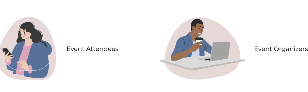

📌 In this case study , we focus on our first target users: Event Attendees.
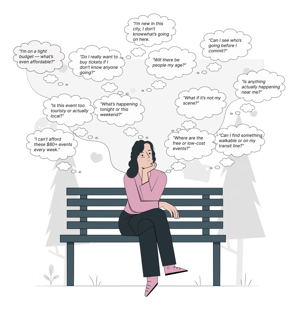
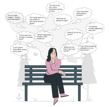
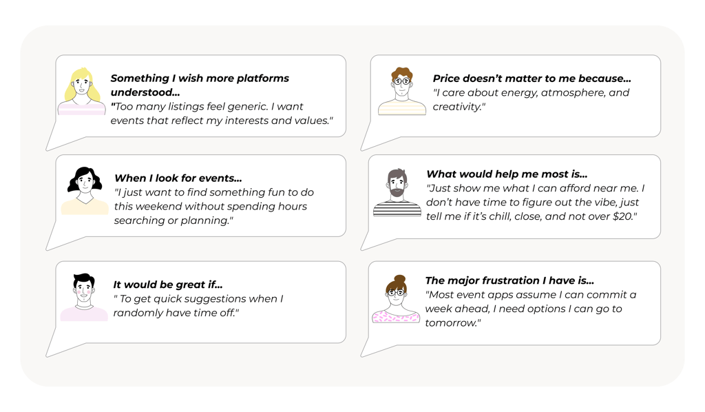
From Their Words to Our Insights
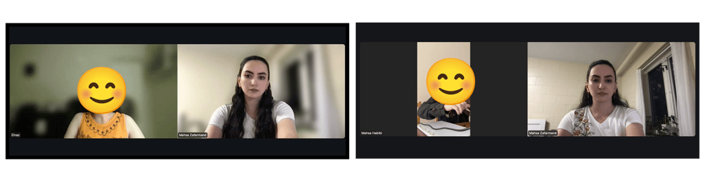
To better understand user needs and pain points, we conducted interviews with 14 people over Zoom.
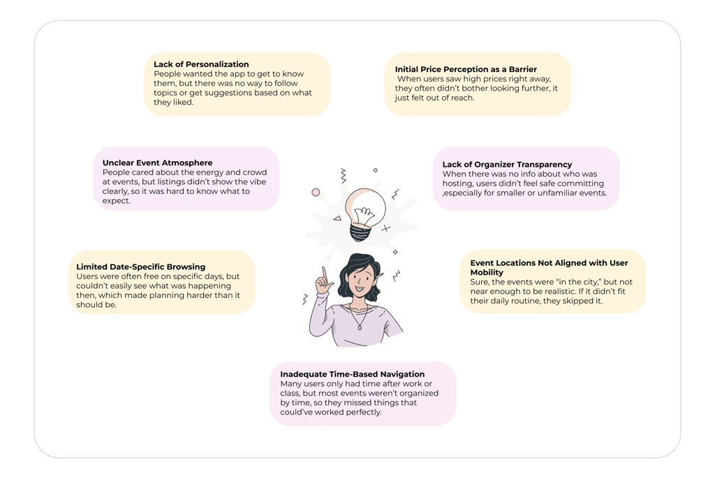
Our interviews revealed key insights:
Hear it from Users:
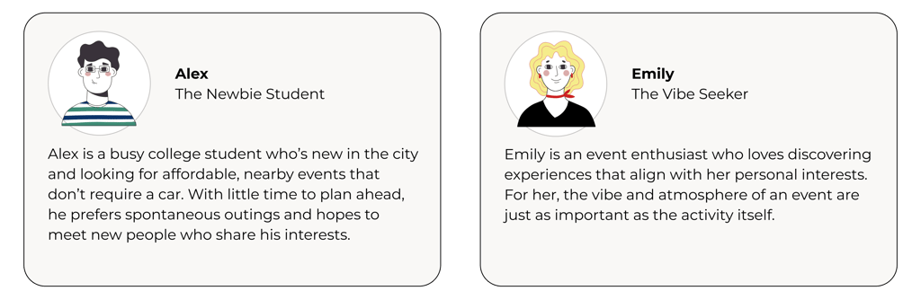
Defining our audience through two key user profiles
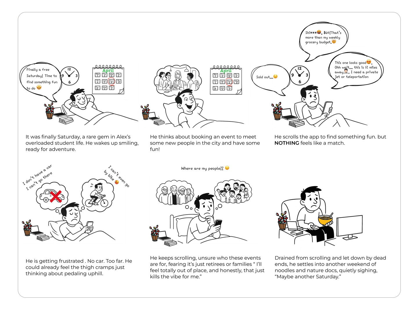
STORYBOARD
By illustrating our persona in a realistic scenario, we uncover the essential features our MVP must include.
At this stage, our goal is to identify the essential features Eventure must support to make users' ideal experiences possible such as affordable, nearby, and interest-matching events. These requirements form the foundation of our design strategy and directly inform the next phase: generating ideas that solve real user pain points.
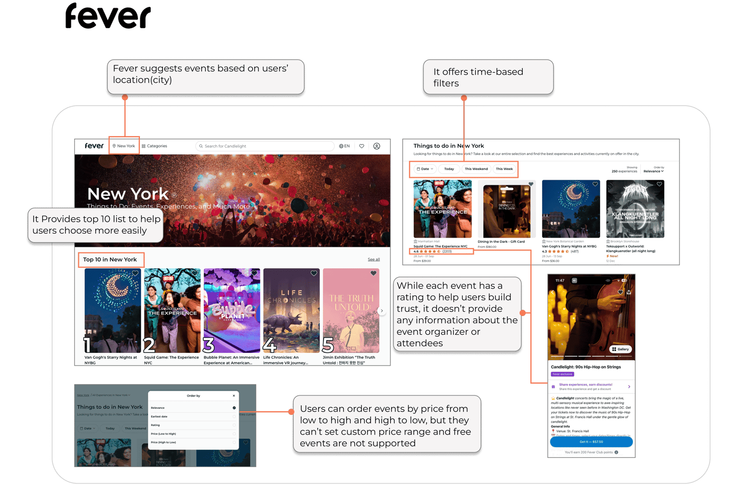
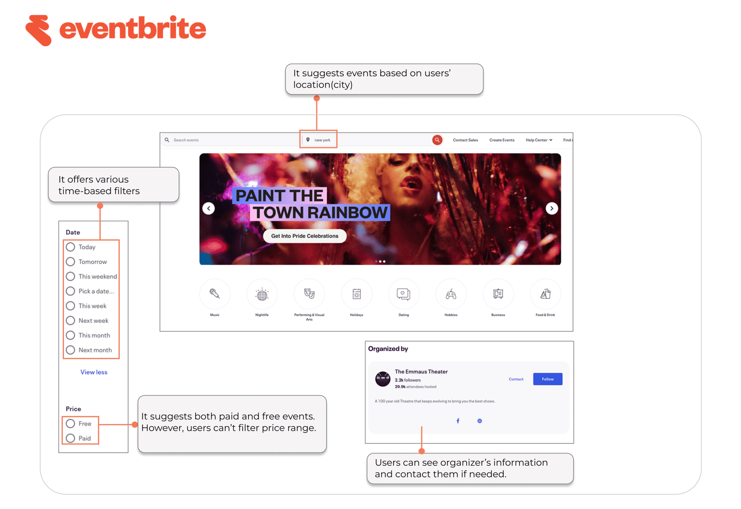
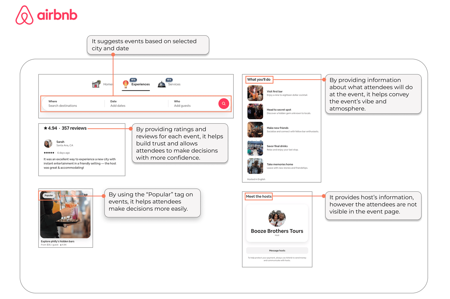
COMPETITIVE ANALYSIS
Now Let’s See What the Competition Is Missing:
To better understand how current platforms meet user needs, We analyzed top event platforms to understand how they address user needs like affordability, proximity, vibe, and trust.
We focused specifically on how these platforms address key user needs such as affordability, proximity, vibe, and trust, and identified what they often overlook. These gaps informed critical areas of opportunity for Eventure’s design strategy.
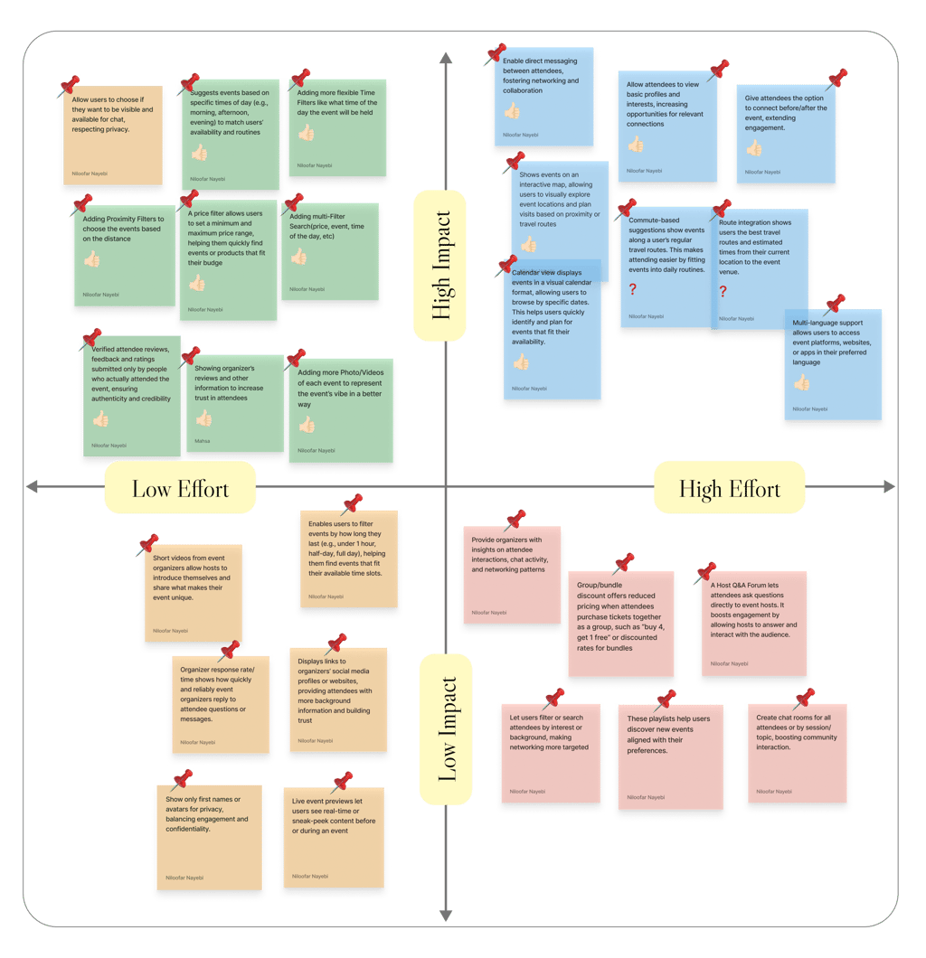
BRAINSTORMING AND IMPACT-EFFORT MATRIX
Prioritizing What Matters Most !
After identifying user pain points and gaps in existing products, we began brainstorming solutions. We generated a wide range of ideas aimed at addressing the most critical user needs. Using the Impact-Effort Matrix, we prioritized features that offer the highest value with the least complexity , helping us focus our MVP on what matters most, quickly.
FEATURE PRIORITIZATION
Balancing Value and Effort with User Needs!
Using Impact–Effort Matrix we focused our MVP on high-impact, low-effort features that addressed key user pain points. While prioritizing simplicity, we also included select high-effort features like attendee visibility and connection because they were critical to building trust and community, core to Eventure’s value.
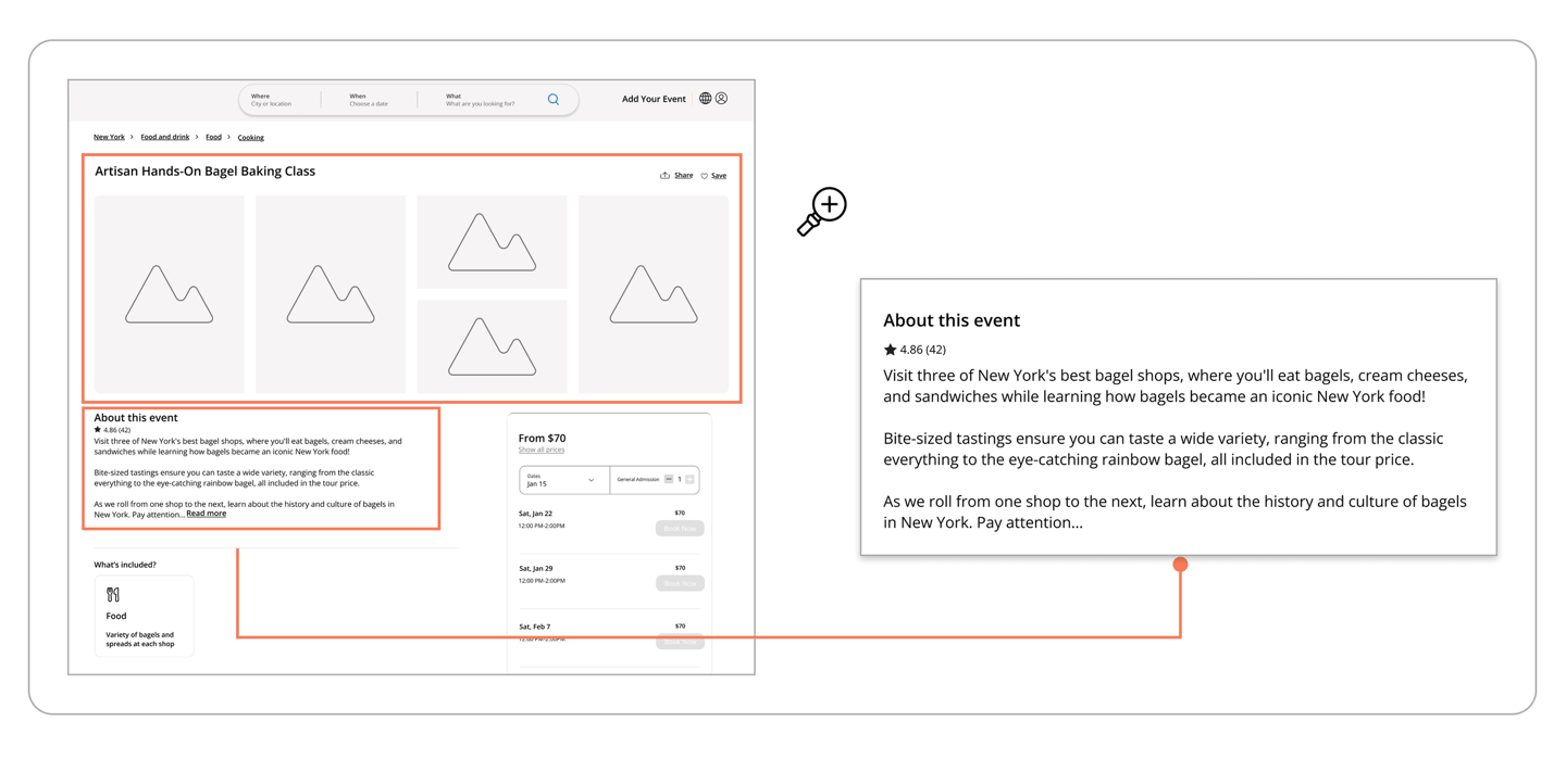
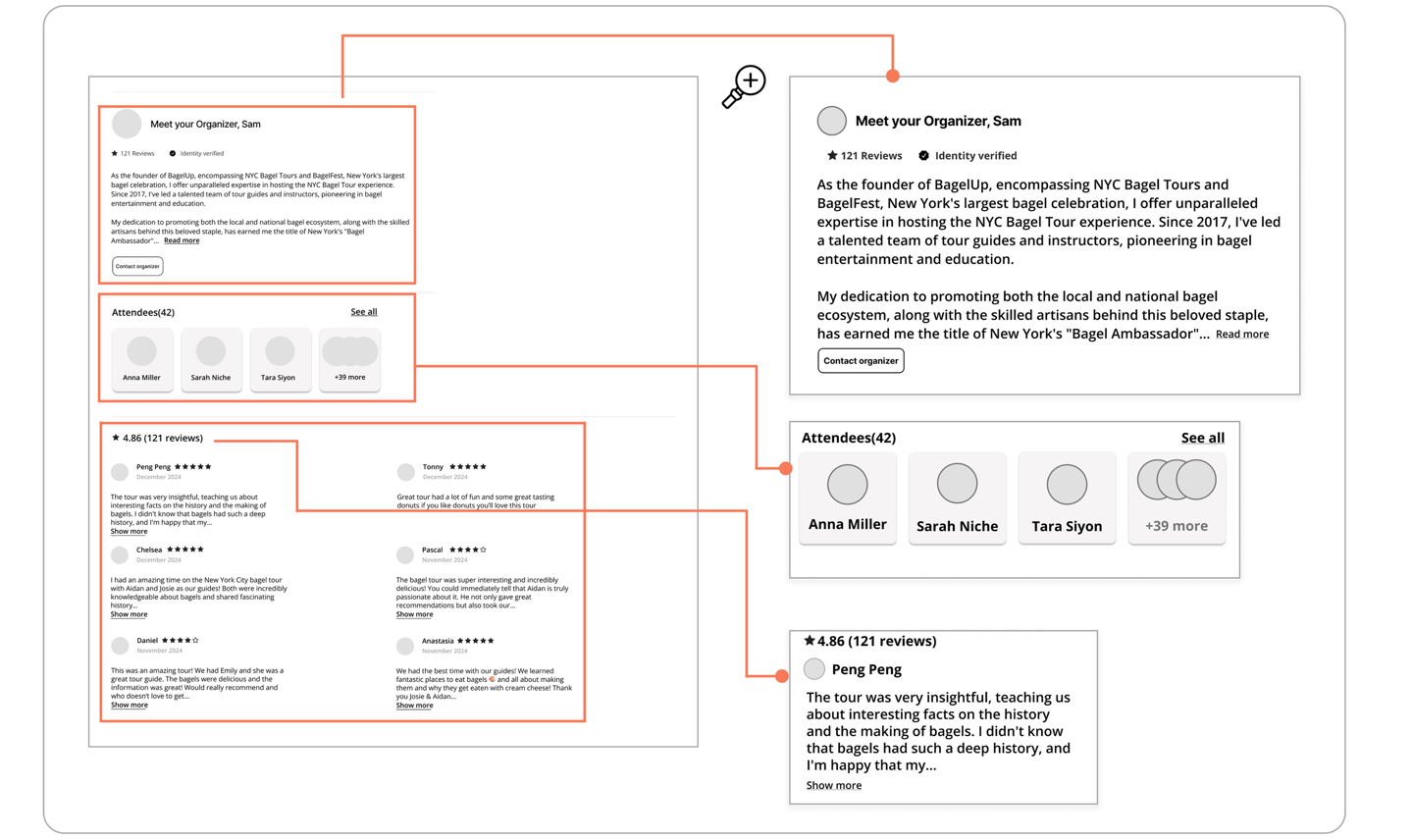
All solutions are zoomed in on the right panel to enhance clarity and highlight design changes.
The left frame shows the full layout for overall context.
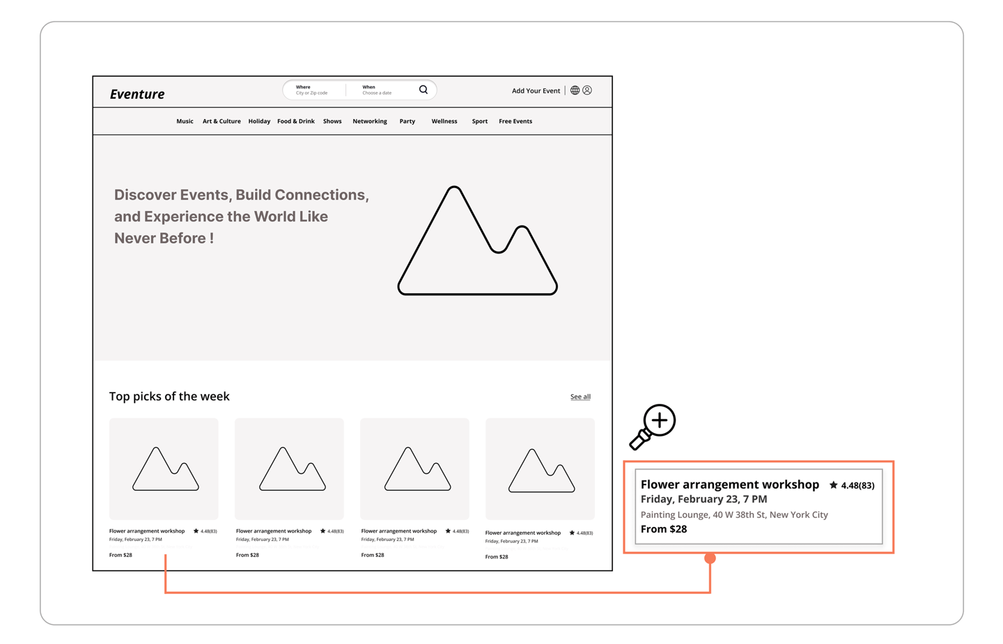
I want to browse events quickly without having to click for basic info.
Users found browsing slow and frustrating due to the need to click multiple times for basic event details
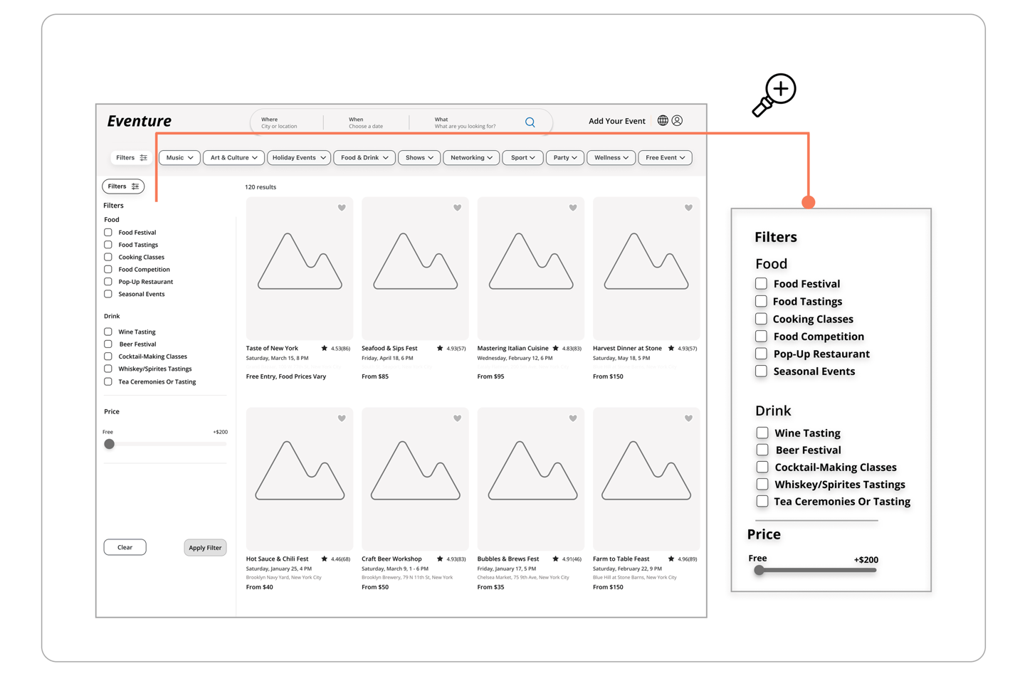
I want to easily narrow down events by category and subcategory and set my preferred price range.
Users found it difficult to filter events efficiently and wanted more control over price and categories.
I want to understand the vibe of an event right away.
Users wanted a clearer sense of the event’s atmosphere to decide if it matched their interests. We added more visuals and an ‘About This Event’ preview help users instantly grasp the event’s vibe.
I want to feel confident that the event and organizer are trustworthy.
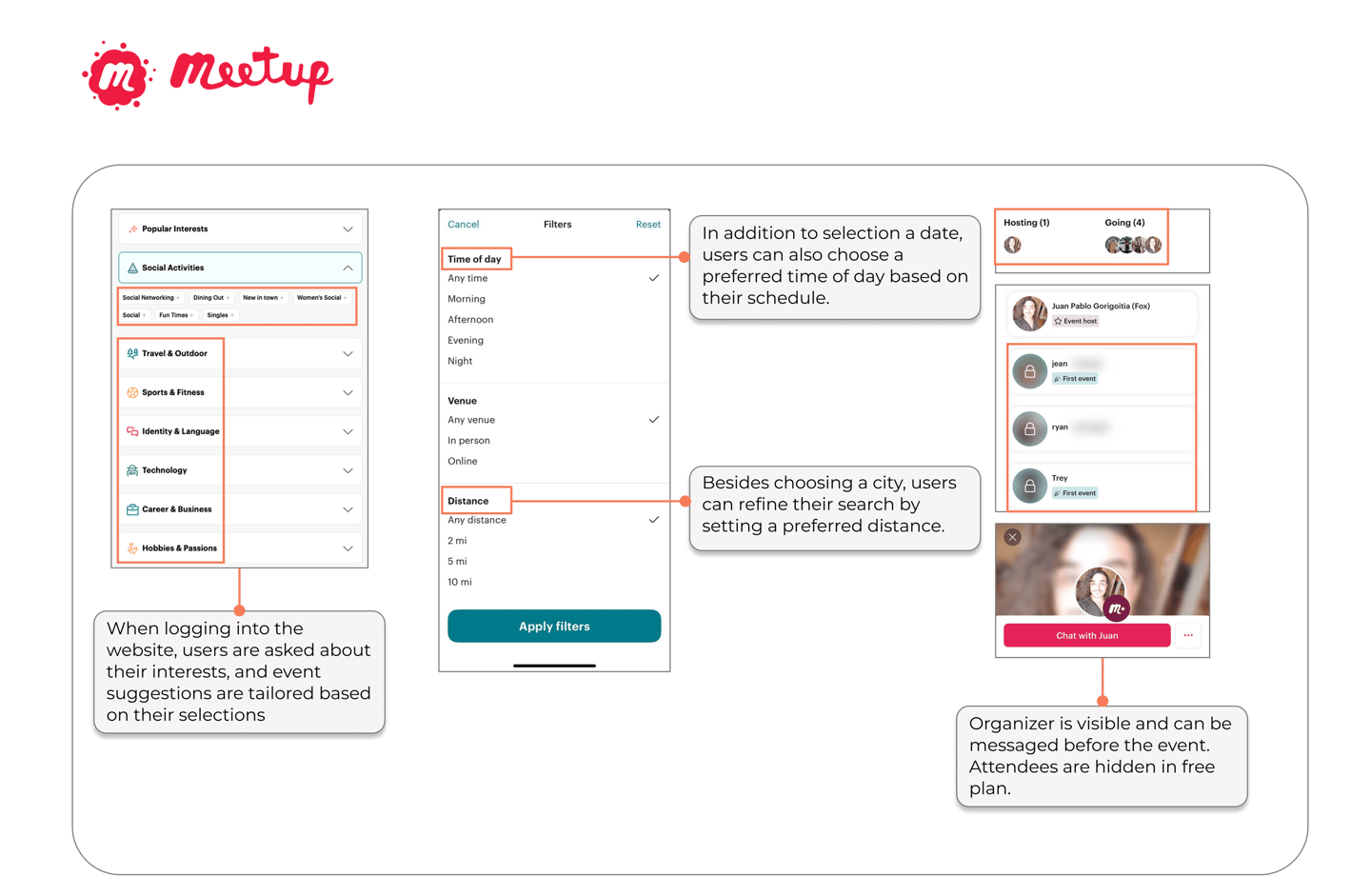
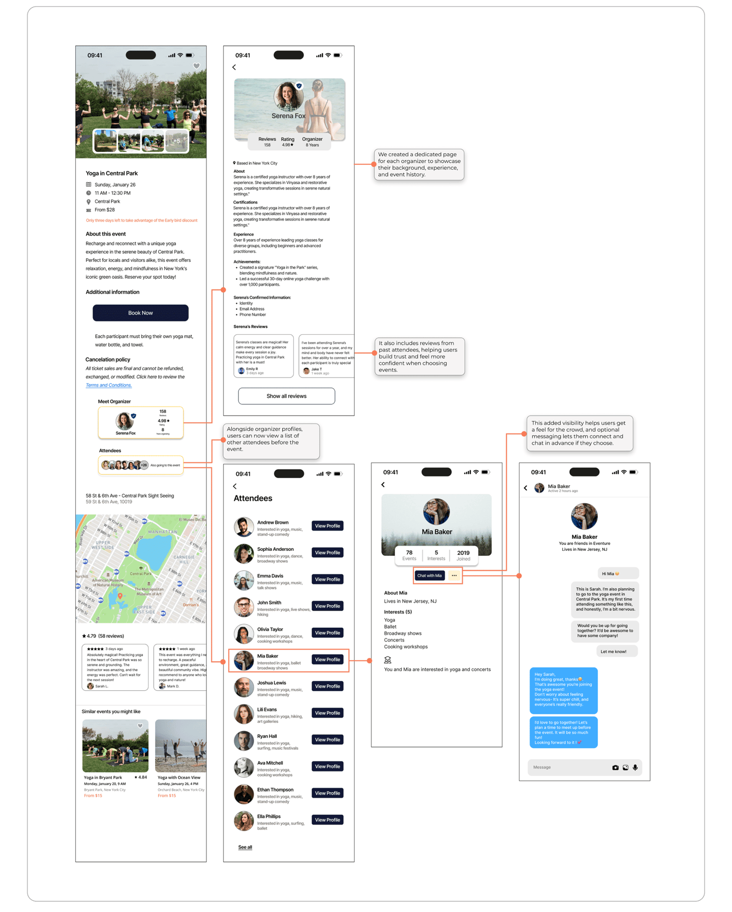
Users struggled to trust the reliability of events and the credibility of organizers. So, we added organizer profiles, attendee visibility, chat, and reviews to build trust and transparency.
Validating with Real Users
We asked participants to complete event discovery scenarios across both the website and mobile application. By observing how they navigated the interface, interpreted features, and worked toward their goals, we uncovered areas of friction. Through multiple rounds of feedback, we reduced cognitive load and made essential iterations.
All solutions are zoomed in on the right panel to enhance clarity and highlight design changes.
The left frame shows the full layout for overall context.
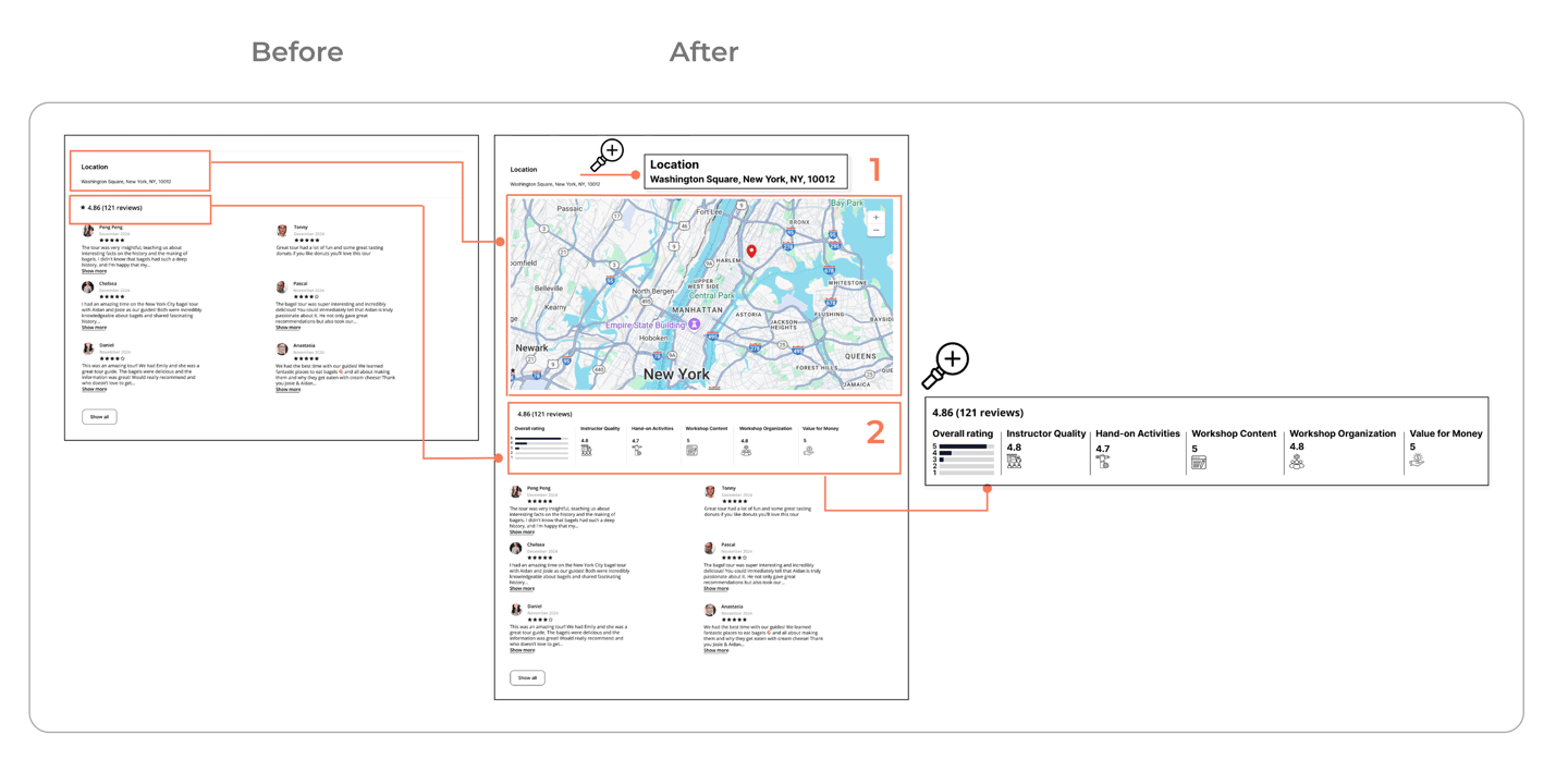
1 .Adding an interactive map
⚫️ Users felt uncertain about where events were actually located and how accessible they were.
⚫️ Added an interactive map to show event locations and help users plan with confidence.
2.Making Ratings Make Sense
⚫️ Users couldn’t tell what ratings meant, making it hard to judge event quality or trust organizers.
⚫️ We added clear, category-based ratings with visual breakdowns to build trust and guide decisions.
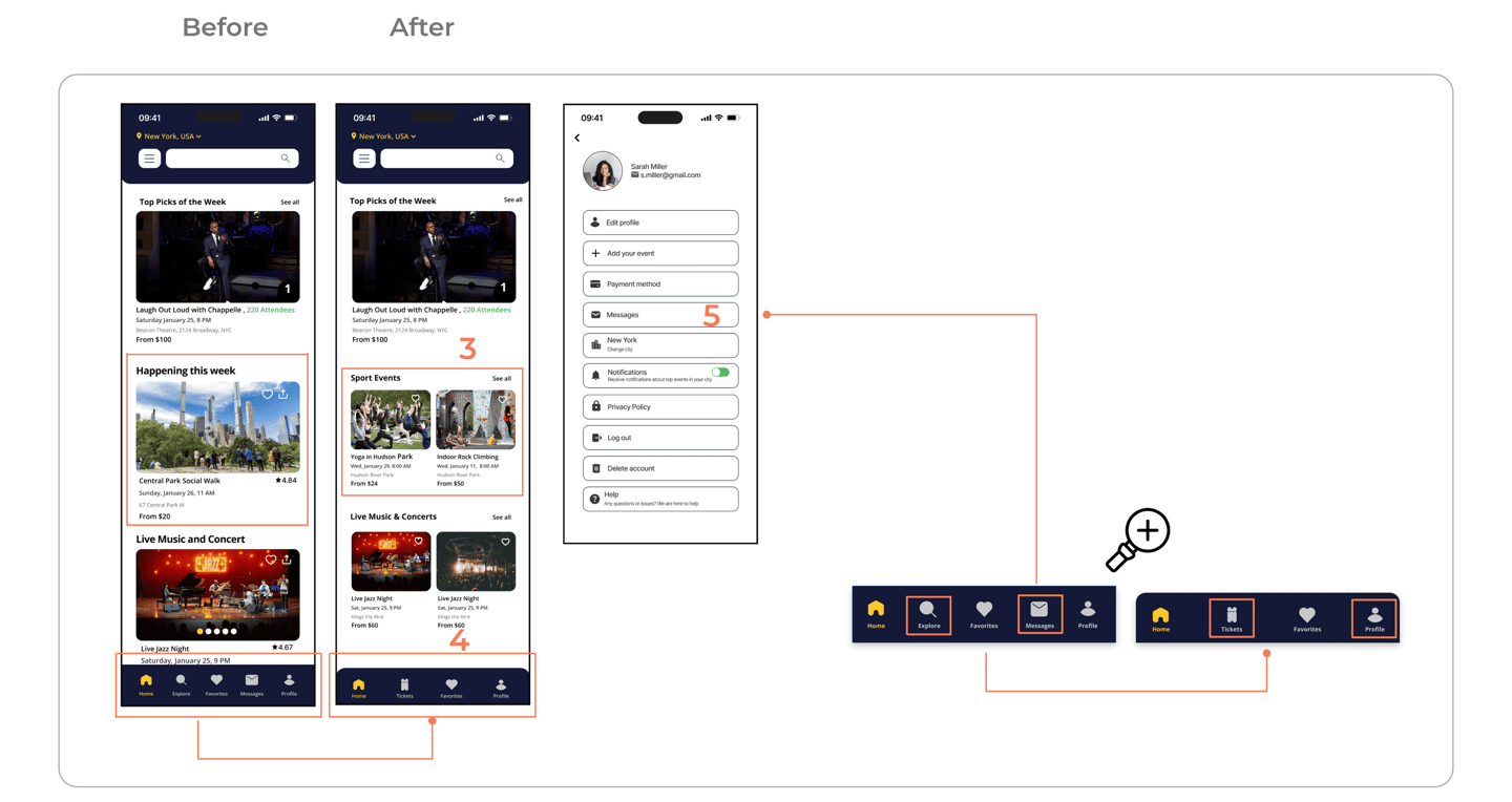
3. Improved Event Grid Layout
⚫️ Displaying two events per row improved space usage and made browsing faster.
4. Replaced Messages with Tickets
⚫️ Displaying two events per row improved space usage and made browsing faster.
⚫️ Relocated “Messages” into the “Profile” section for a more intuitive and organized layout.
5. Removed Redundant Explore Tab
⚫️ Eliminated the “Explore” tab to reduce overlap with the top search bar and simplify navigation.
6. Updated Price Color for Clarity
⚫️ Changed price text from red to black to prevent confusion with sold-out events.
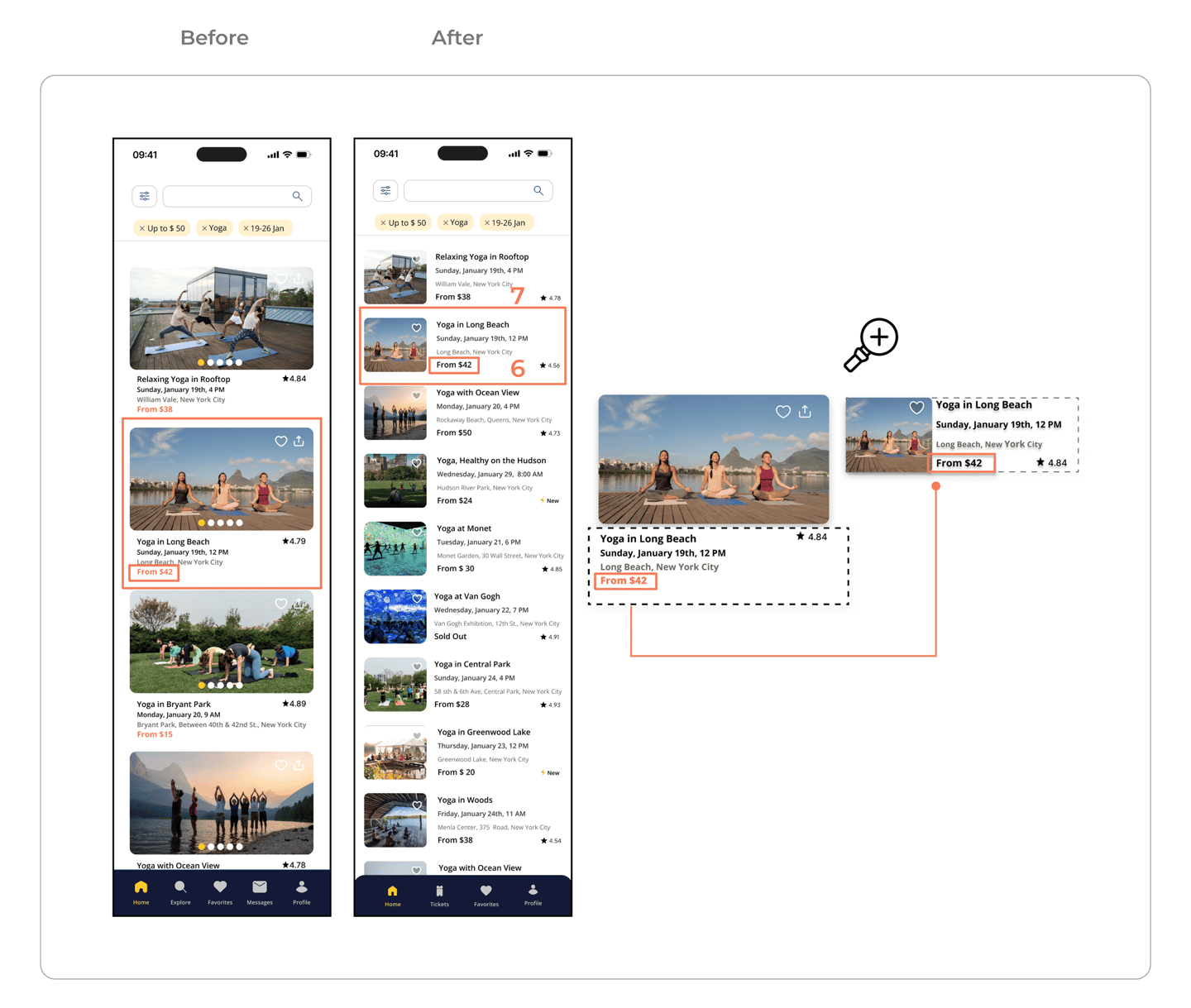
7. Improved Event Card Layout
⚫️ Reduced image size and placed event details beside it to make scanning faster and browsing more efficient

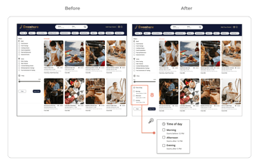
8. Introduced Time of Day Filter
⚫️ Enabled users to easily browse events that fit their schedule : morning, afternoon, or evening, making discovery faster, more relevant, and less overwhelming.
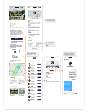
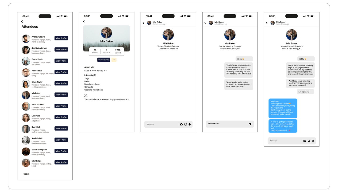
Preview the Crowd, Join the Vibe
Users wanted more than just event details. They wanted to know who else would be attending, get a sense of the vibe, and connect with like-minded people in advance.
To support this, we introduced attendee visibility and connection, allowing users to see who’s going and chat with others before and after the event.
Can’t decide? No time to scroll?
Users often felt overwhelmed by endless event listings, unsure where to start or what to trust. To reduce decision fatigue and help them discover great events faster, we introduced a curated “Top Picks of the Week” section, highlighting standout events based on popularity, vibe, and user preferences.
What’s On This Week?
Many users wanted a quick way to browse only what’s coming up soon without digging through long lists. We added a “Happening This Week” section to surface timely events at a glance, making it easier to make last-minute plans and stay in the loop.
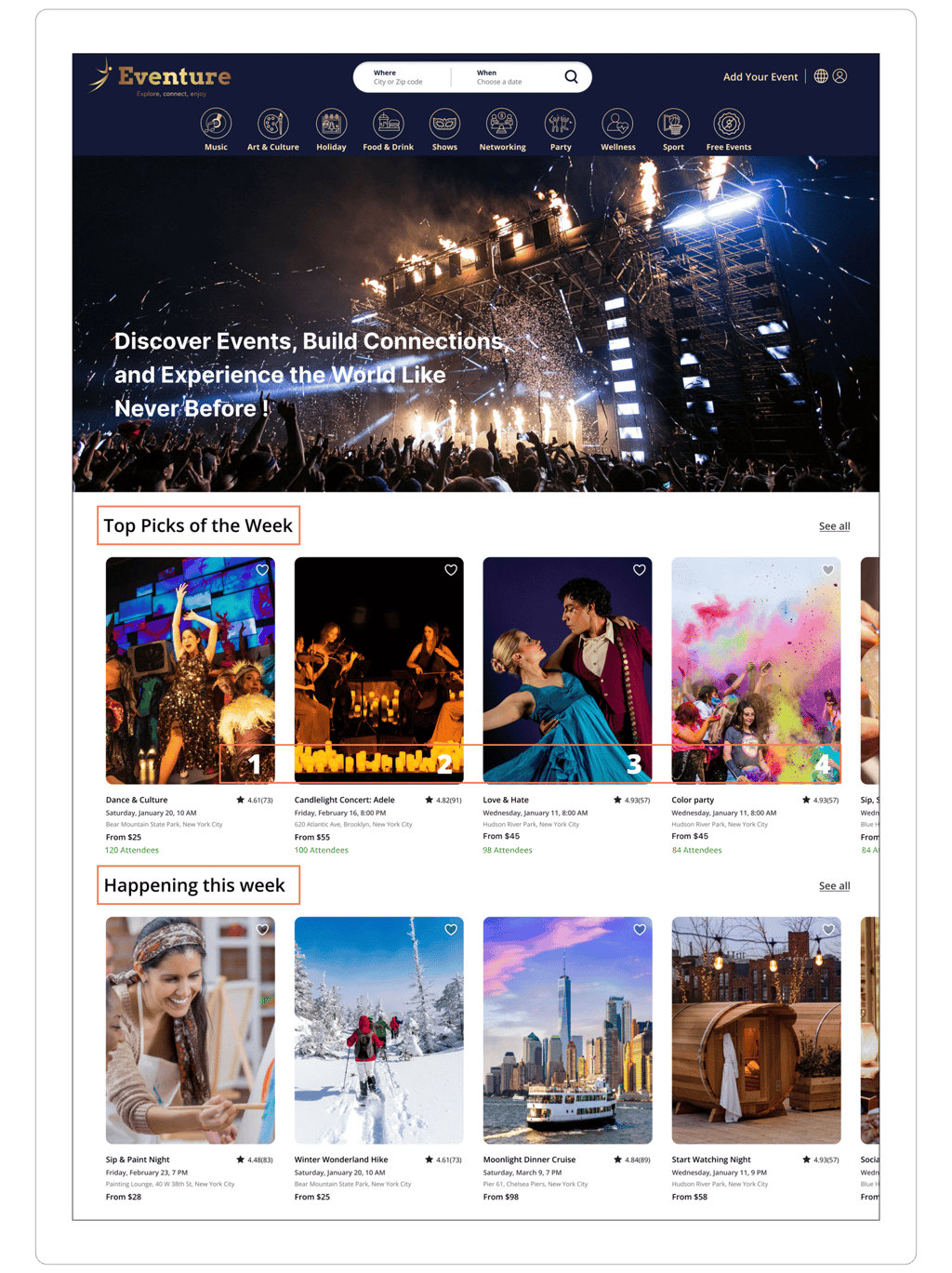
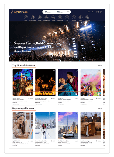
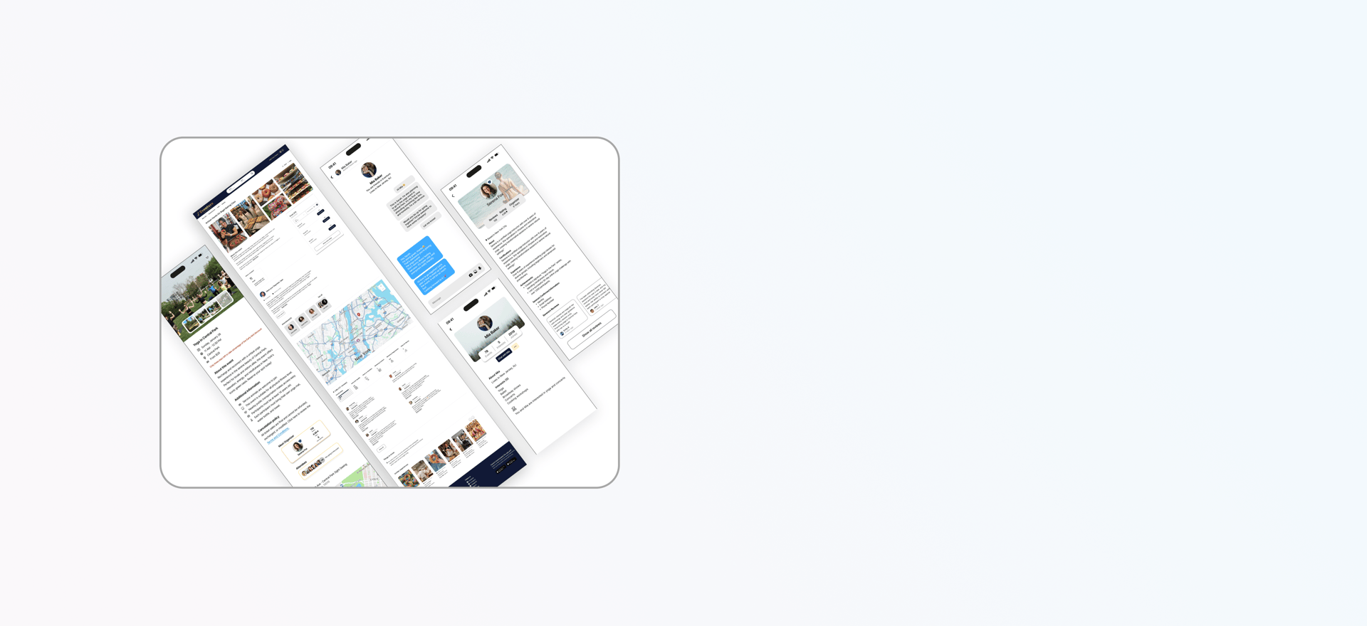
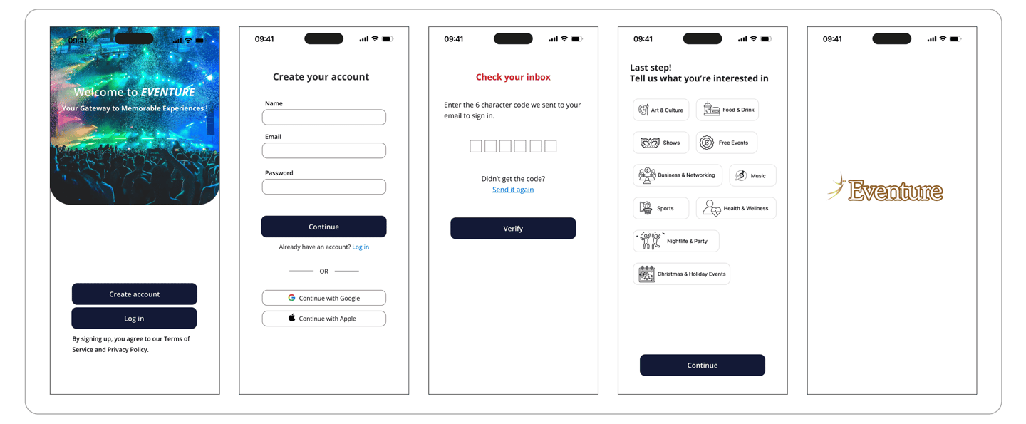
Some of the final MVP product
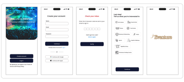
Onboarding + SignUp
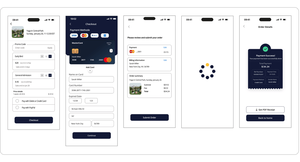
Checkout
Connecting and Messaging